my role
sole product designer · 0 to 1 research · UX/UI · AI integration logic
the context
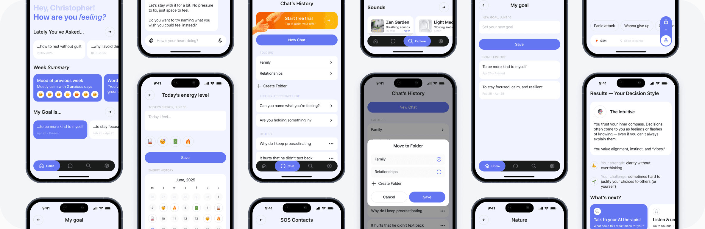
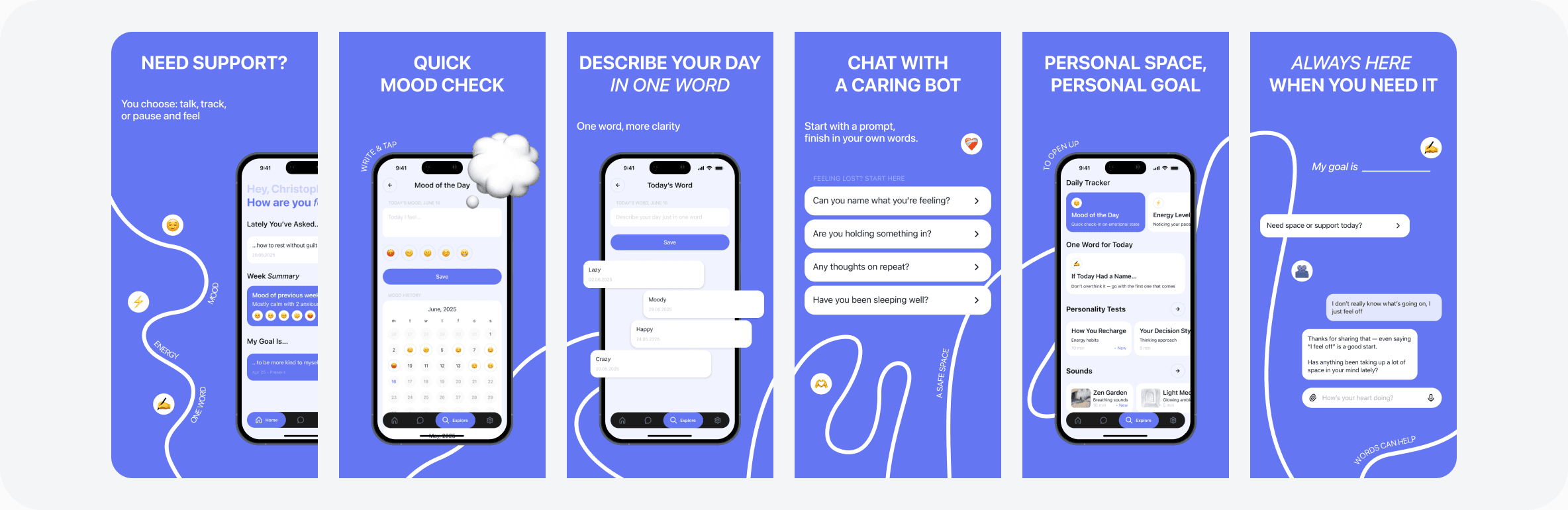
A startup approached me to design an MVP for an AI-supported mental wellbeing app. The idea was a gentle daily companion: AI chat, mood and energy tracking, short self-reflection tests, calming sounds, and simple goals.
Not a replacement for therapy. A softer entry point for people who need support but aren't ready for something clinical.
I owned the entire design process from research to final screens.
the problem
The mental wellbeing app space is crowded. But most existing products have the same issues: UI that feels busy and overwhelming, a tone that's either too clinical or too gamified, and an implicit message that the app can replace real therapy.
For people already dealing with anxiety or emotional exhaustion, a product that adds cognitive load or feels pushy does the opposite of what it promises.
The opportunity was clear: calm, warm, honest. A product that feels safe to open on a hard day.
competitive research
I reviewed six apps in the space: Wysa, Earkick, Stoic, Youper, Mello, and Elomia.
The common problems across all of them were predictable once you looked: cluttered interfaces, inconsistent tone, and a tendency to either over-promise or over-gamify. A few implied they could replace therapy, which is both misleading and potentially harmful.
What none of them quite got right was the combination of warmth and simplicity. That became the design direction.
hypotheses
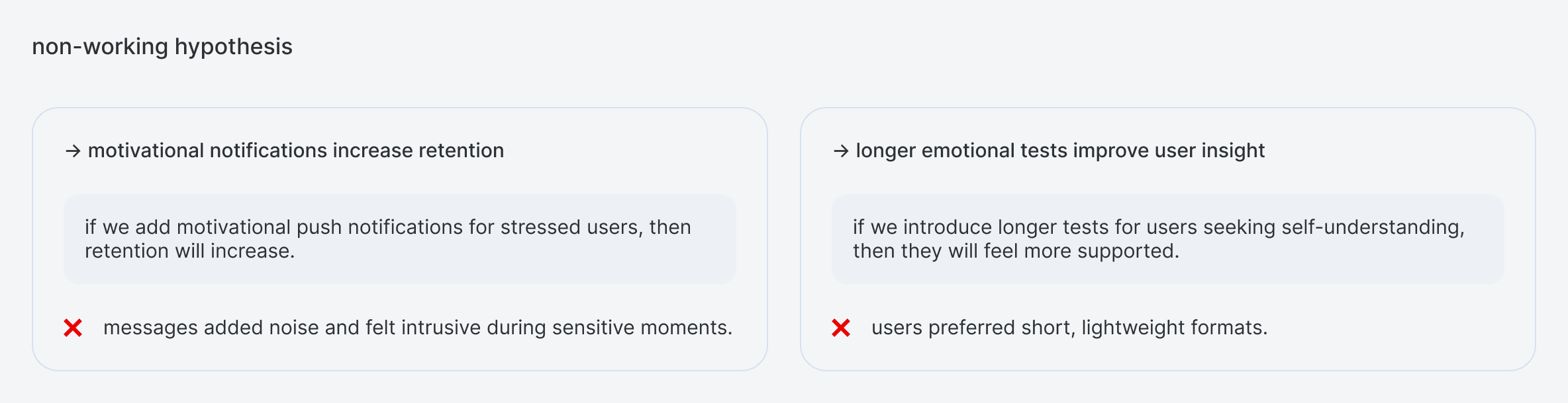
I built and tested a set of design hypotheses before committing to solutions.

the design
The visual and interaction language was built around one idea: this app should feel like exhaling.
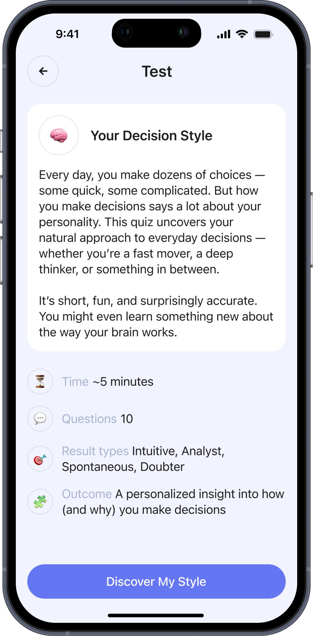
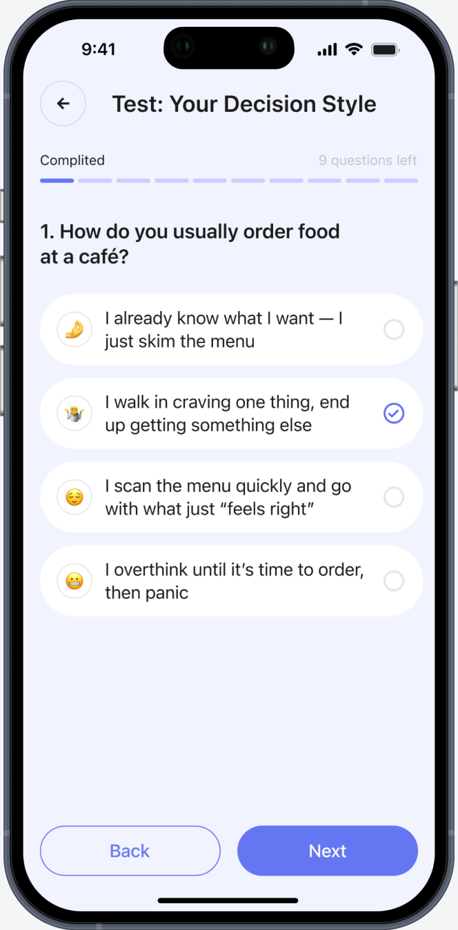
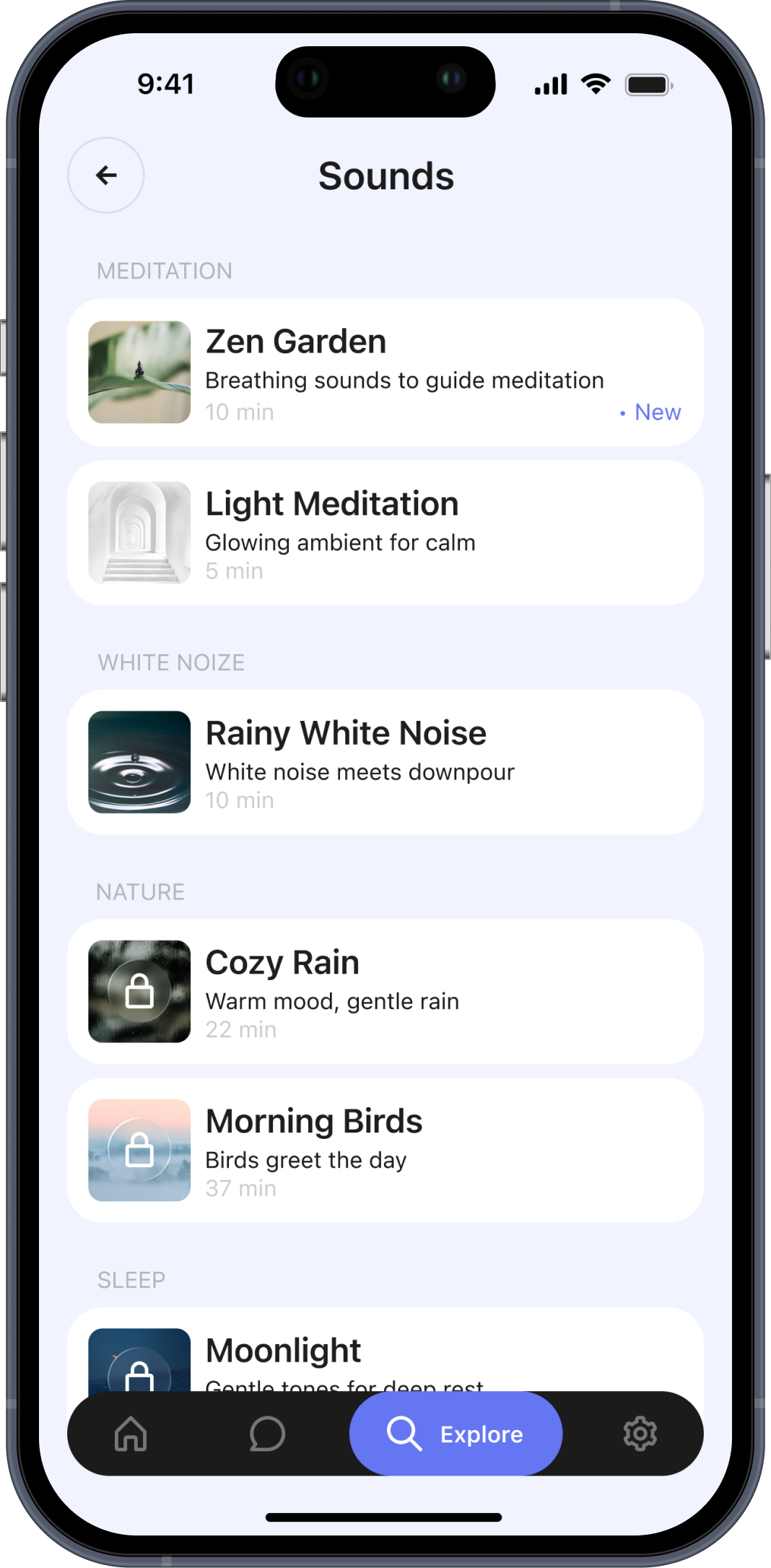
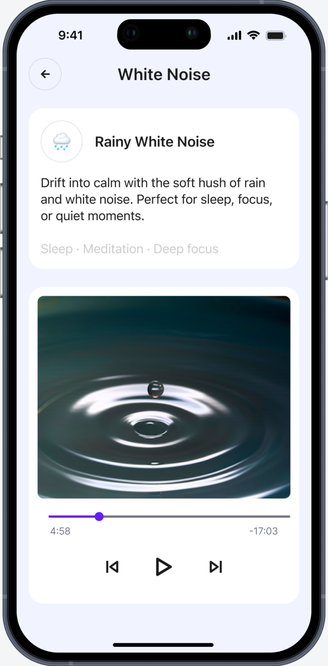
Soft UI, clear navigation, no pressure. Every flow was designed for someone who might be tired, anxious, or overwhelmed when they open it. The AI chat felt conversational rather than clinical. Mood tracking was quick and non-judgmental. Tests were short. Sounds were there if you wanted them, invisible if you didn't.
The app also included a clear signal pointing users toward real therapy when needed. That boundary was part of the design, not an afterthought.
outcome
The MVP covered onboarding, AI chat with folder organization, daily mood and energy tracking, short self-reflection tests, ambient sounds, and simple goal-setting. The product was in active development when the startup shut down.
What stayed with me from this project was how much the emotional context of the user has to shape every design decision — not just what the interface does, but how it feels to interact with it when you're not okay.



i know ideas can change the world