my role
sole product designer CRM & mobile app · B2B & B2C
team
product manager · 2 developers · designer · analyst
the context
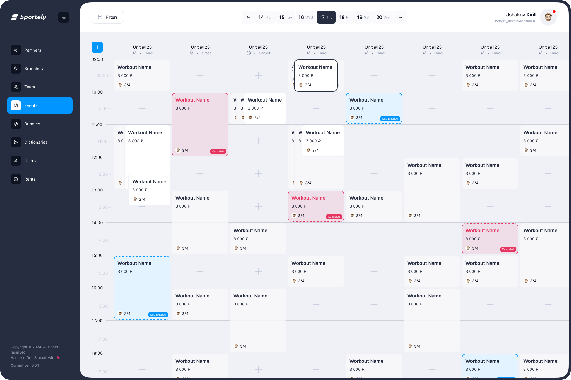
Sportely is a SportTech platform that connects sports venues, trainers, administrators, and end users through a CRM for partners and a mobile app for clients.
When I joined, both products already existed. My work wasn't to build from zero. It was to make what existed actually work: remove friction, fix broken flows, add what was missing, and think ahead to where the product was going next.
This case shows a selection of what I worked on. Not everything, just the parts that tell a story.
the problem
Two products, Two audiences. Neither one was broken, but both were slower and more confusing than they needed to be.
Partners and admins were dealing with complex CRM flows that took too many steps for everyday tasks. Mobile users were getting through the booking flow, but barely. And across both products, inconsistency was piling up: different patterns for the same actions, unclear states, overlapping sections.
The goal wasn't a redesign. It was removing friction from the things people do every day.
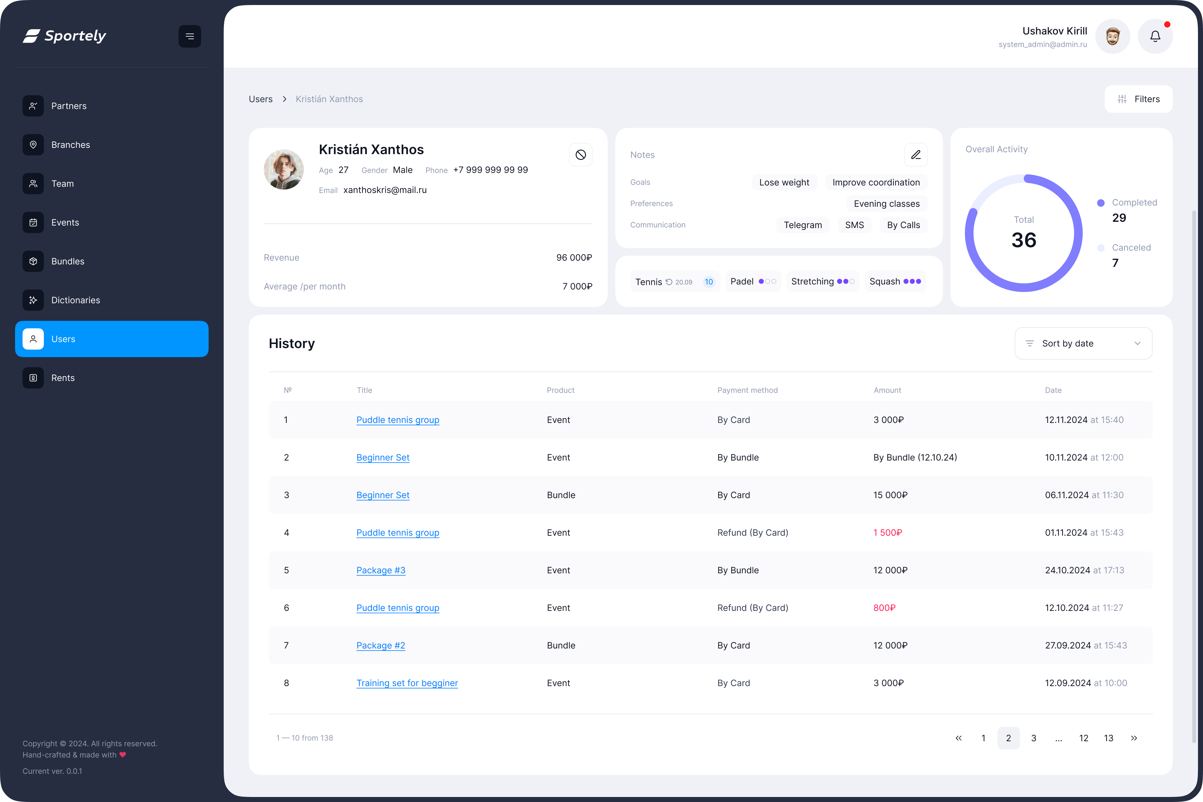



01. CRM · user profile header
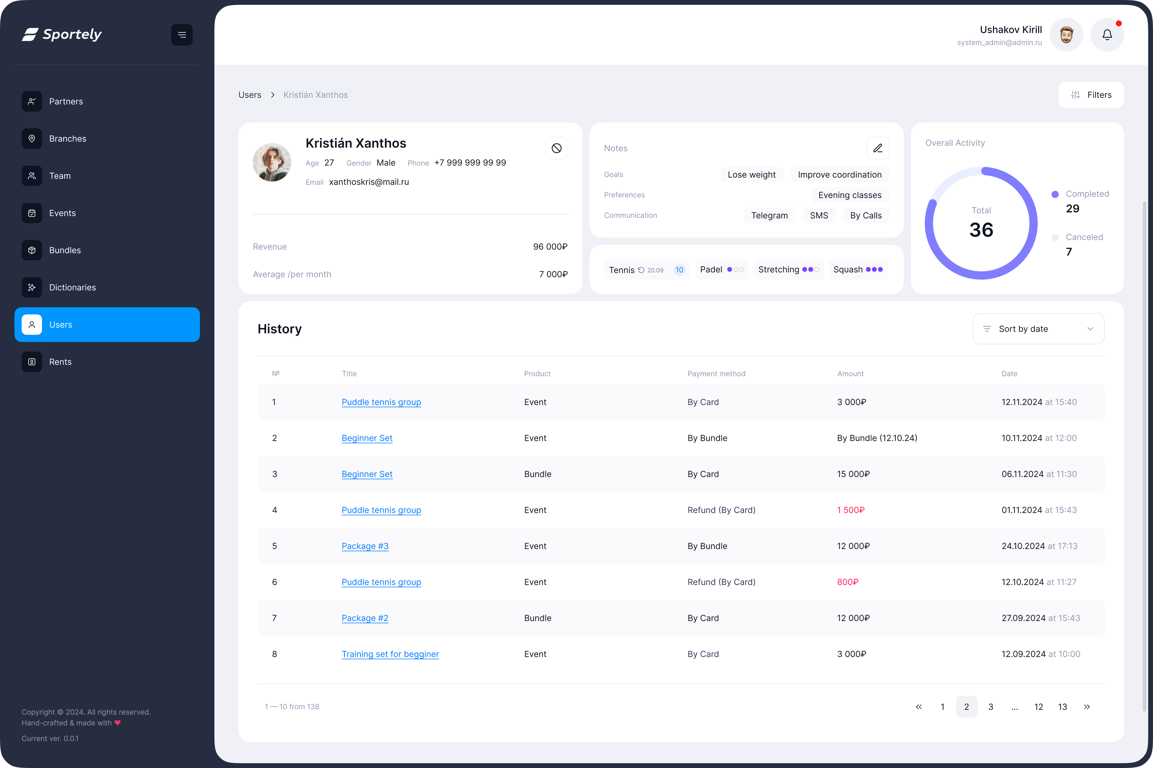
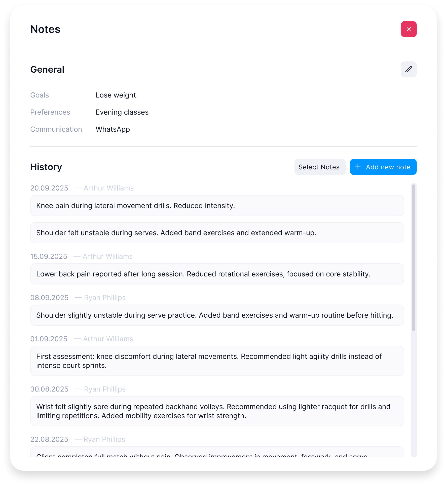
The client profile page had a problem: too much data, no structure. Activity, revenue, goals, communication preferences, skill levels were all there, just scattered across the page.
Admins and partners needed to understand a client at a glance before acting. The old layout made them hunt for information every time.
I redesigned the header as a modular block with clear information groups: personal data and financials in one area, structured notes (goals, preferences, communication channels) in another, sport-specific skill badges that could scale as the product expanded to new sports.
Less scrolling, faster decisions, a layout that could grow with the product.
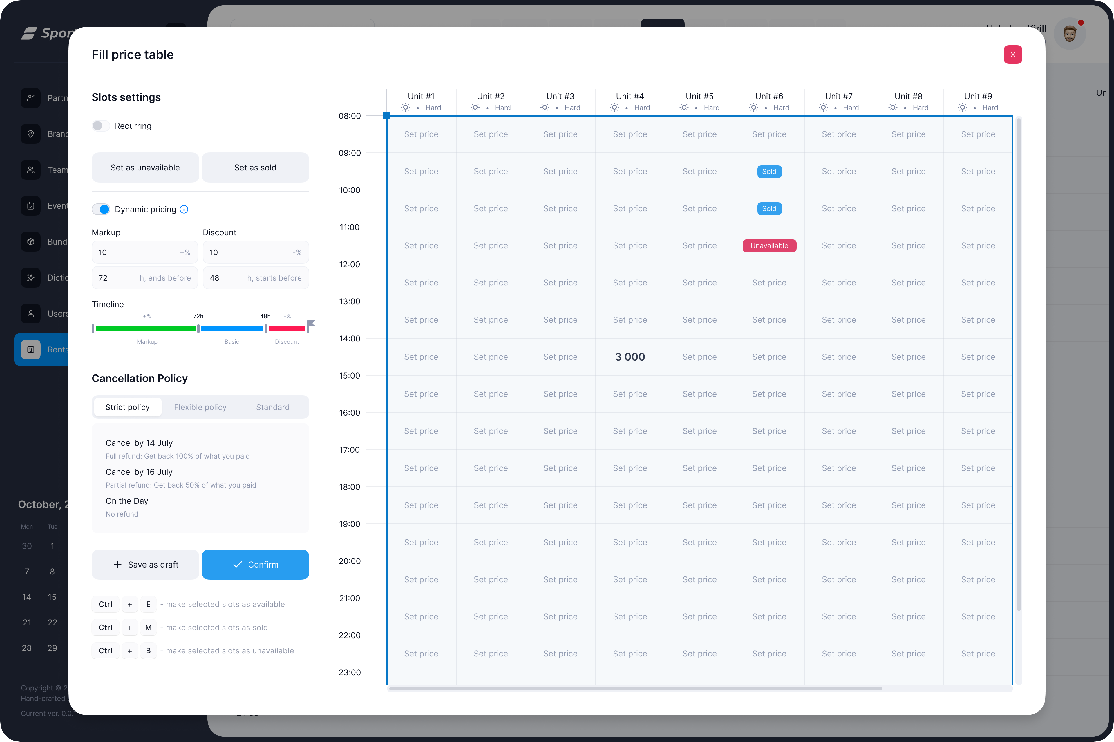
02. CRM · dynamic pricing
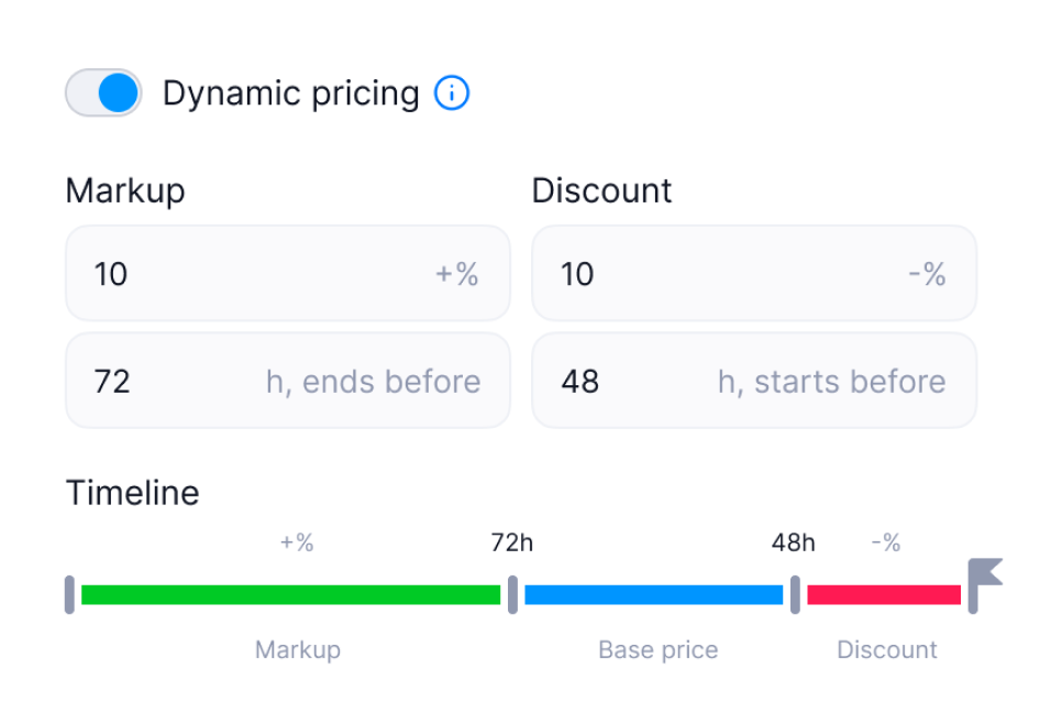
Pricing at sports venues isn't flat. It changes based on time, demand, and how far in advance you book. But the old UI didn't make that visible. Partners had to configure values in separate fields with no sense of the full picture.
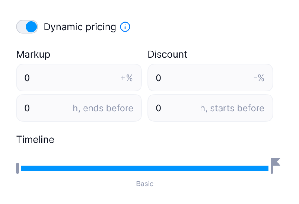
I designed a new pricing module with a visual timeline: markup zone in green, base price in blue, discount zone in red. You set the values, and the timeline shows you what the pricing curve actually looks like across the day.
It turned an abstract configuration task into something you could see and reason about.
03. Mobile · rental flow
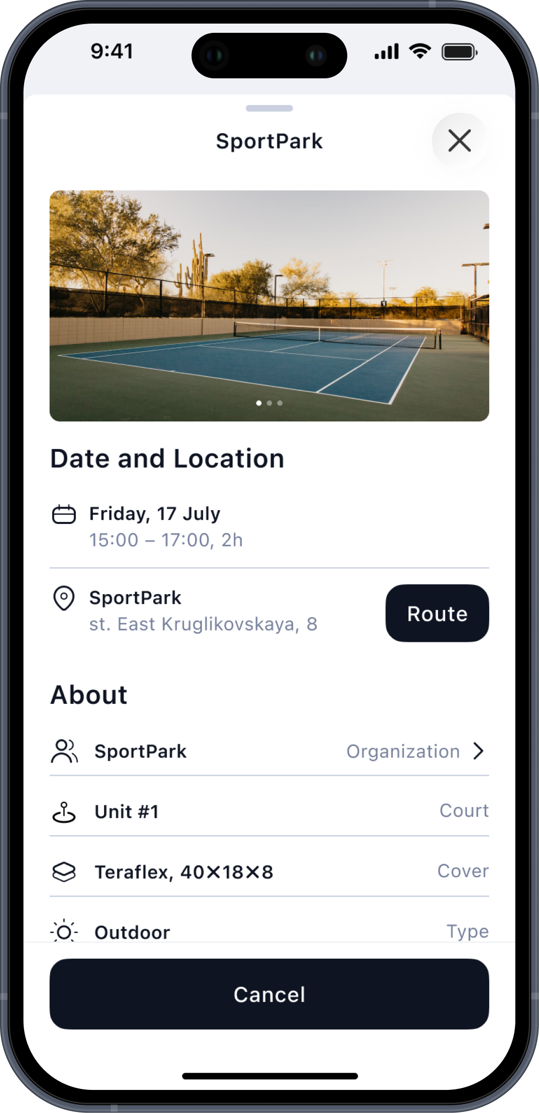
The booking flow for court rentals had too many steps and one invisible problem: users had to navigate to a venue detail page before they could see available slots. That meant an extra tap every single time.
I redesigned the flow so the venue list shows the right information to make a choice (distance, photos, surface type) and then takes you directly to slot selection without an intermediate screen.
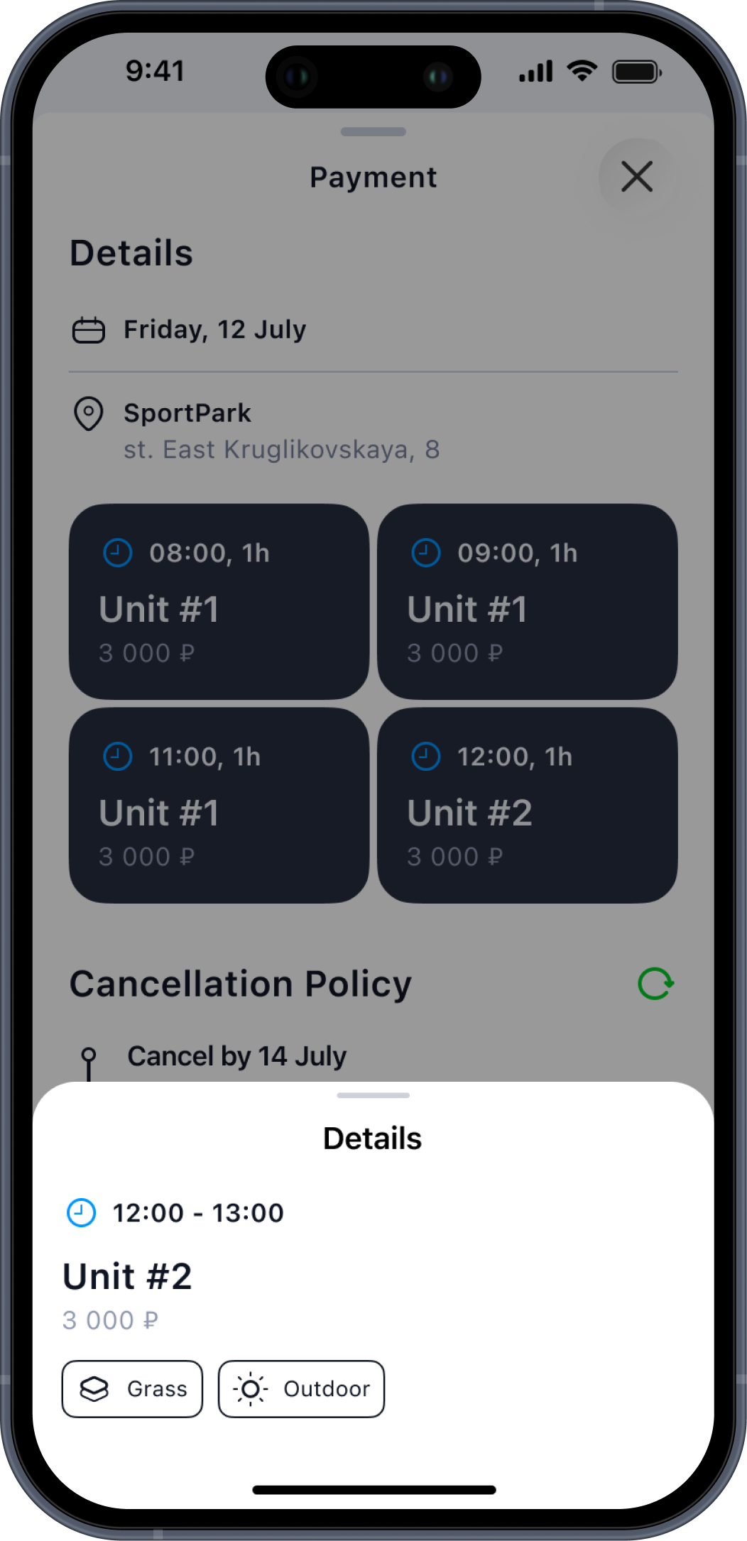
On the payment step I added a block-based preview of selected slots so users could review their choices before paying without going back.
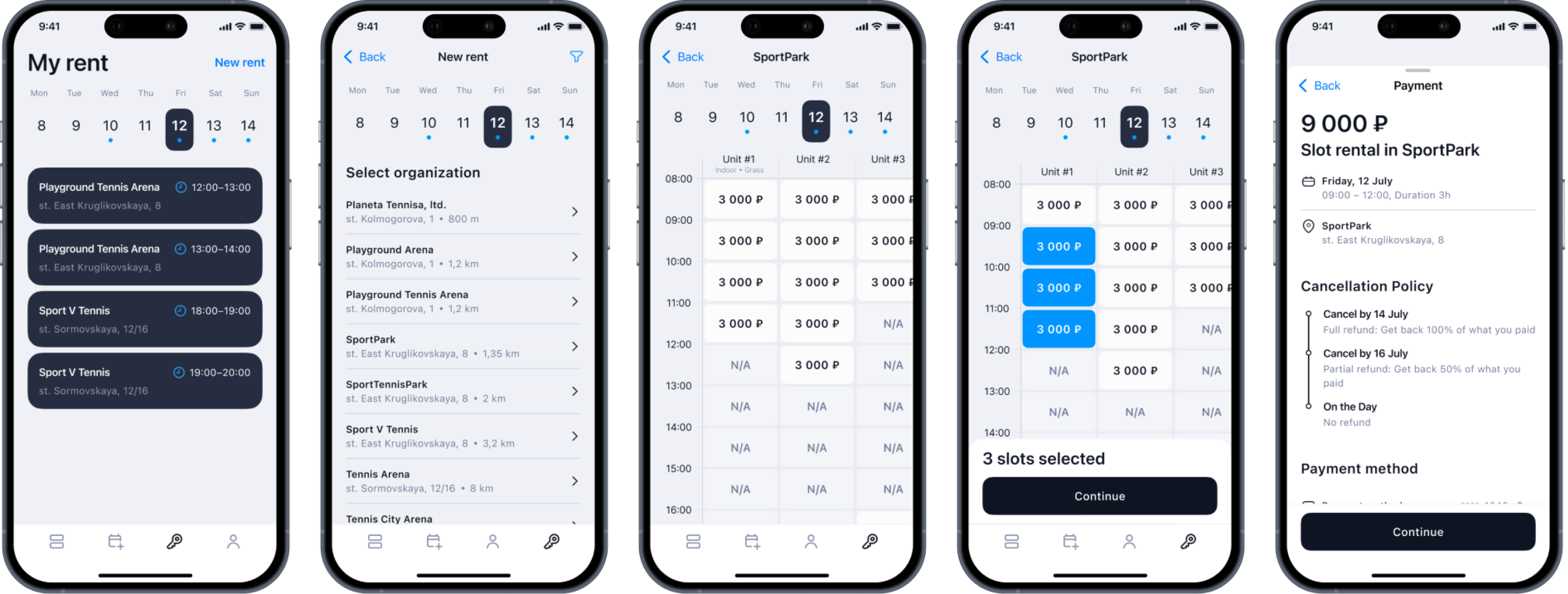
Before: 5 screens to book, unclear entry point, no visual summary at payment.
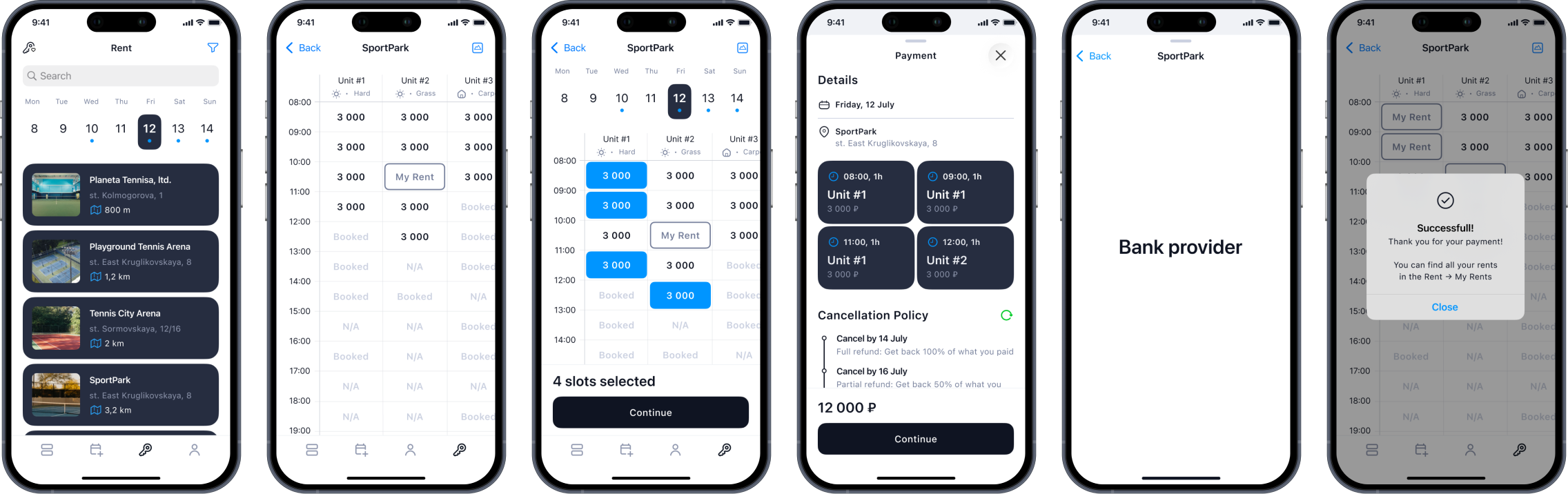


After: 4 screens, direct path to slots, full context at the moment of payment.
04. what was coming next
Some of the most interesting work wasn't about fixing what existed. It was about laying the foundation for where the product was going.
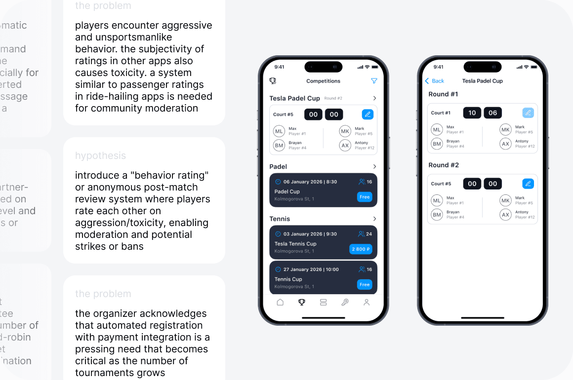
Tournaments were a clear business opportunity: more community, more retention, more recurring bookings for partners. But designing them well required understanding something that wasn't obvious from the outside: how rating systems actually work for recreational players.
I ran interviews with players and tournament organizers. Players didn't just want to compete. They wanted a transparent, fair rating they could trust. Organizers were managing everything in Excel, which didn't scale.
From the interviews I built a set of hypotheses and defined the core logic: an in-app rating verification system, a behavior rating to handle toxicity, automated bracket generation, and auto-matching based on level. The screens cover the tournament list, round structure, and an Elo-based leaderboard with tiebreaker rules and K-factor calibration for new players.
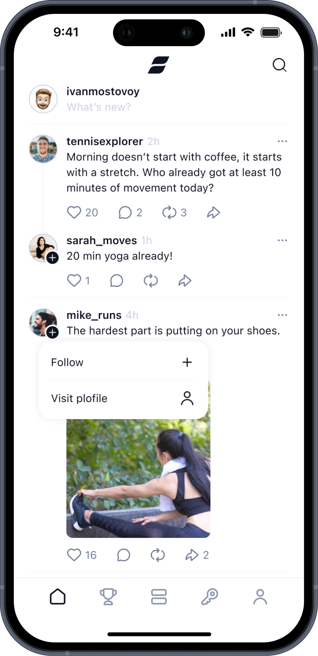
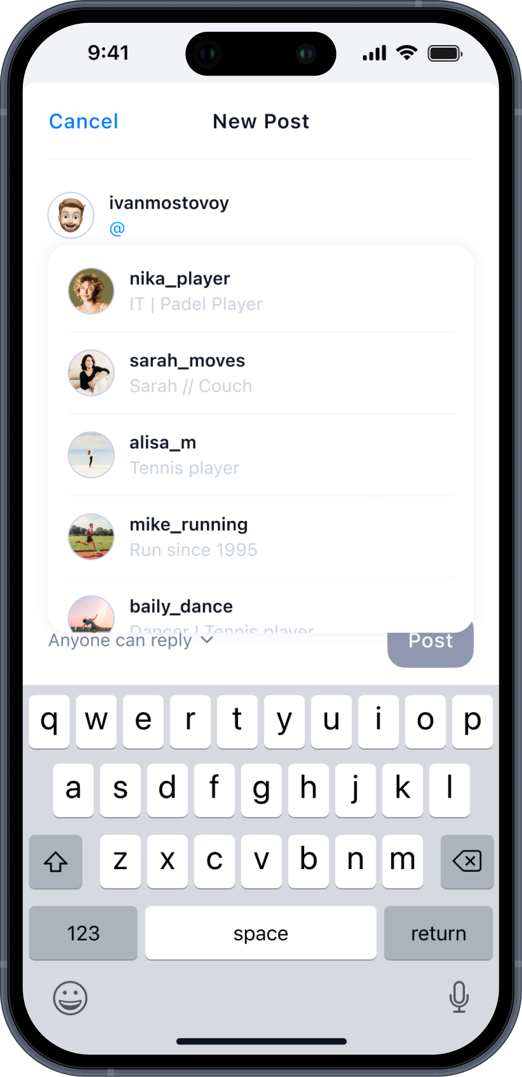
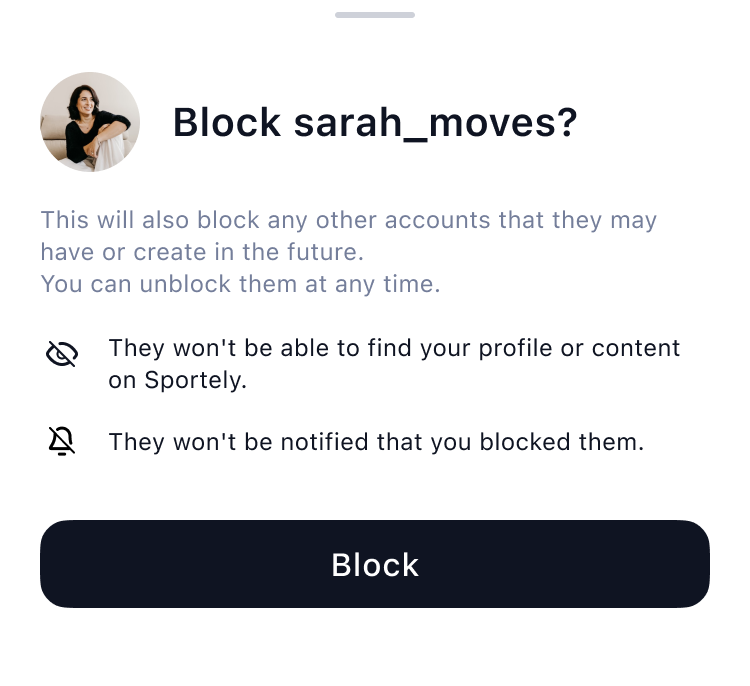
In parallel I scoped out a social feed for the app: posts, comments, following, search, privacy settings, reporting flows. The idea was to give the community a place to exist inside the product rather than scatter across chats and group messages.
Both features were in active development when I left the project.

outcome
In critical user paths, steps to action were reduced by 30 to 50%. Overlapping sections across CRM and mobile were merged into single, clearer flows. The product expanded beyond tennis to padel and stretching, gaining 5+ new partners in the process.
The work wasn't about changing what Sportely was. It was about making it easier to use every day, for the partners running it and the people booking through it.
more projects
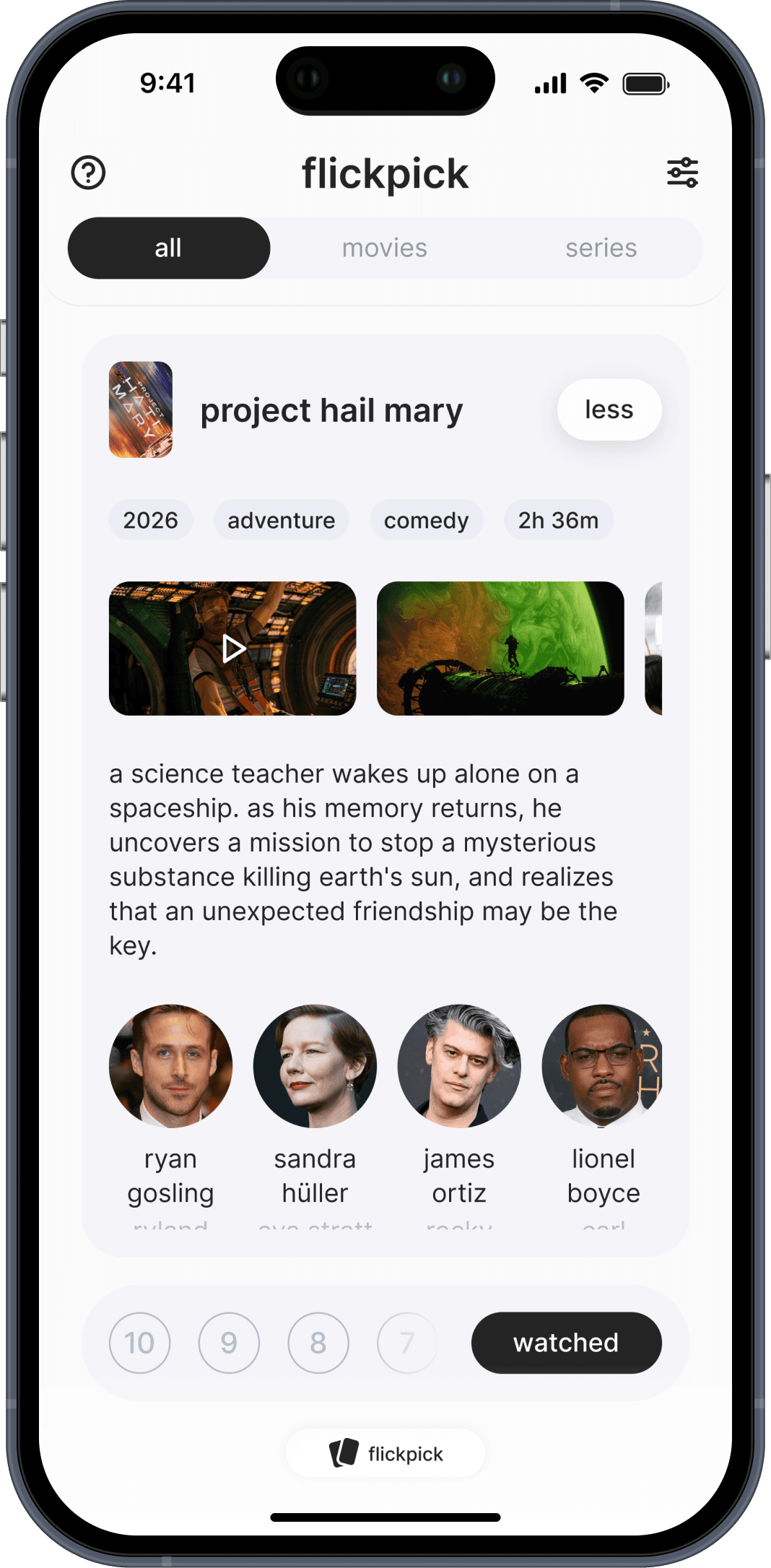
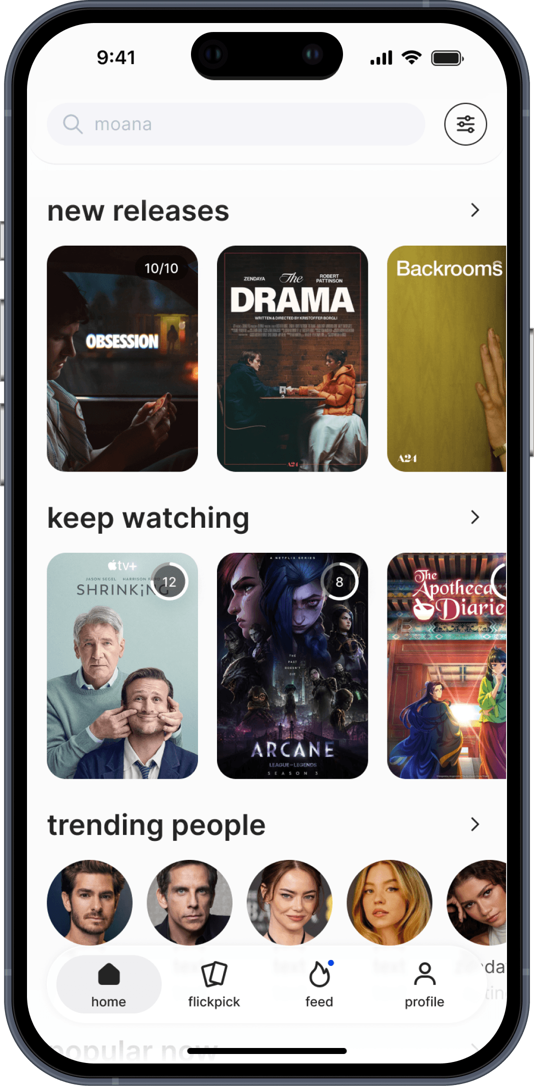
12 months, 2025–now
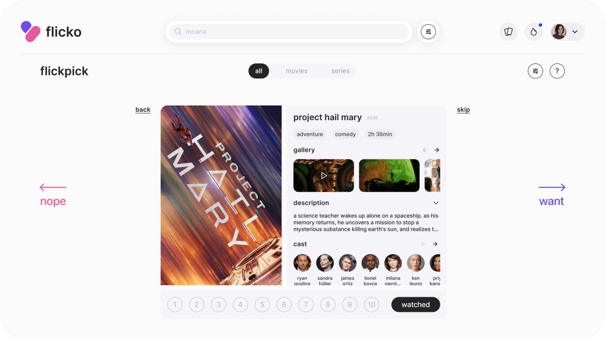
flicko
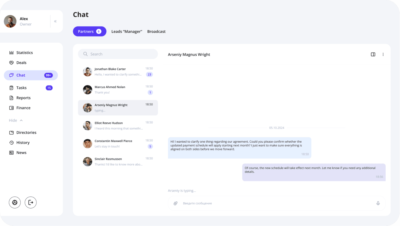
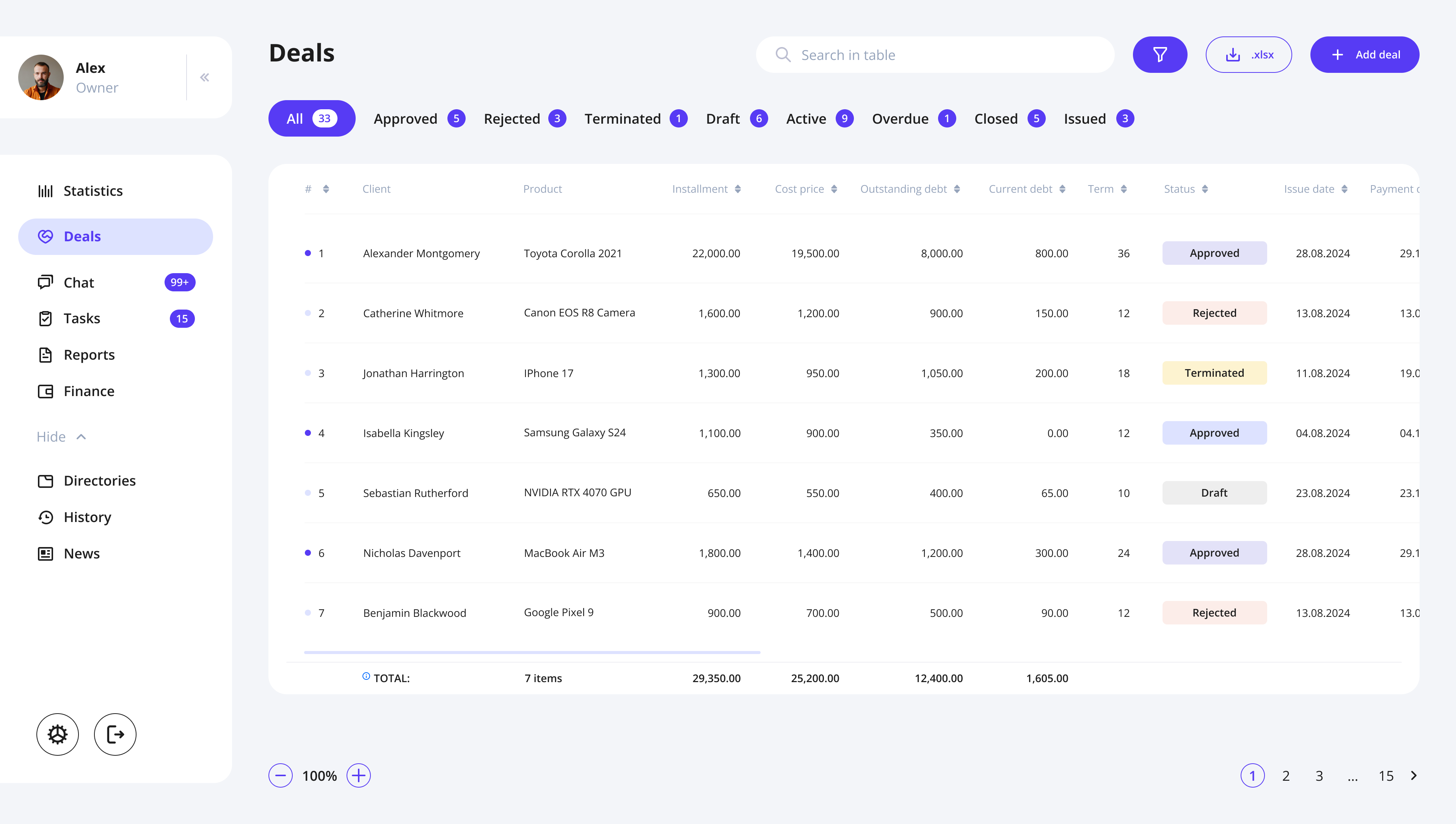
5 months, 2024–2025
finance CRM
1 month, 2026
povee
1 month, 2024
ai psychologist
1 month, 2026
harbour bay

3 weeks, 2025
nirup island


i know ideas can change the world