my role
co-founder · sole product designer web & mobile · 240+ screens · design system × 2
team
co-founder & designer · co-founder & product · developer
the product
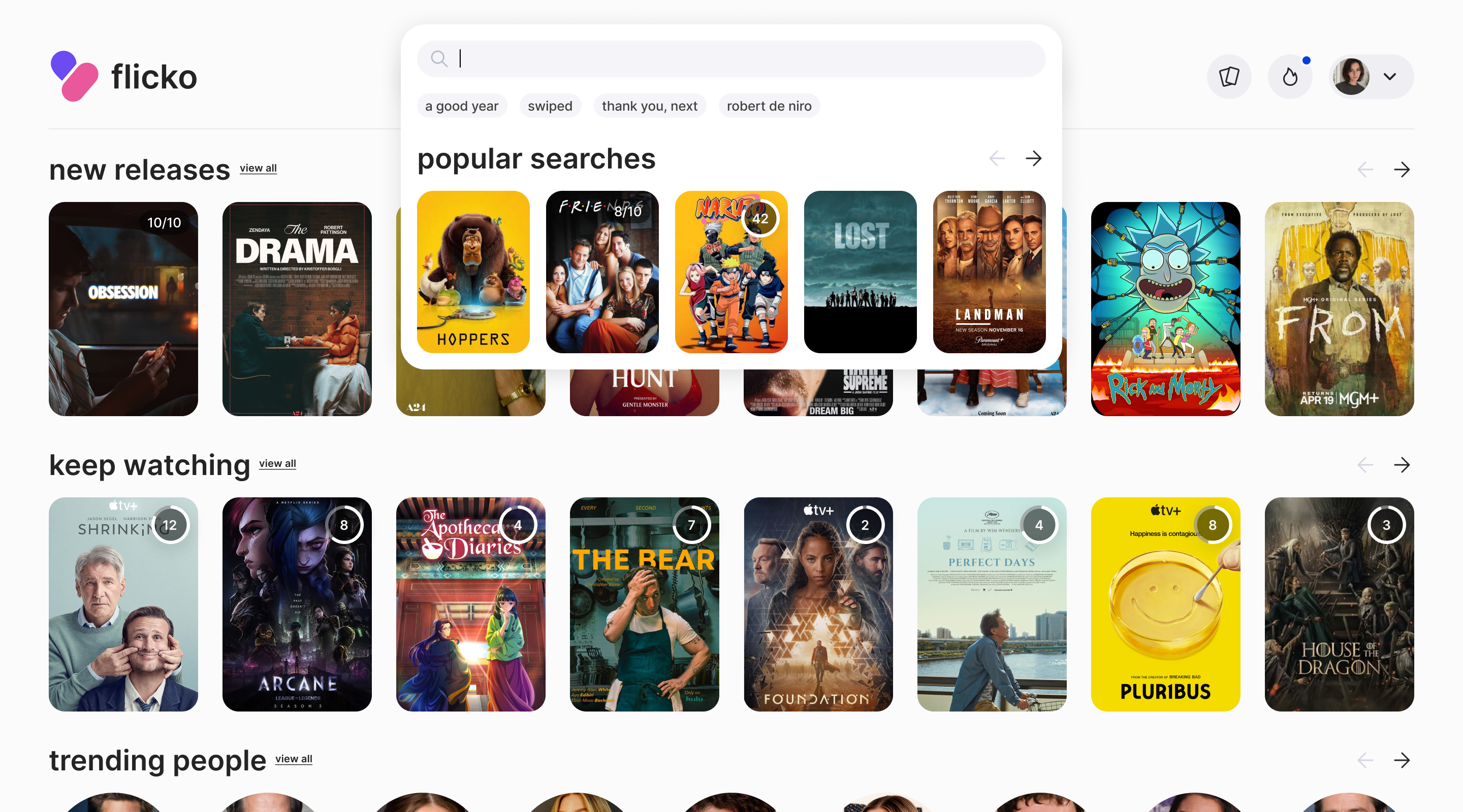
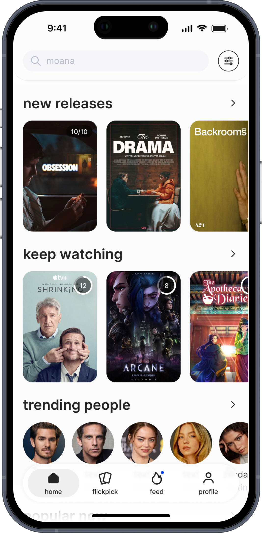
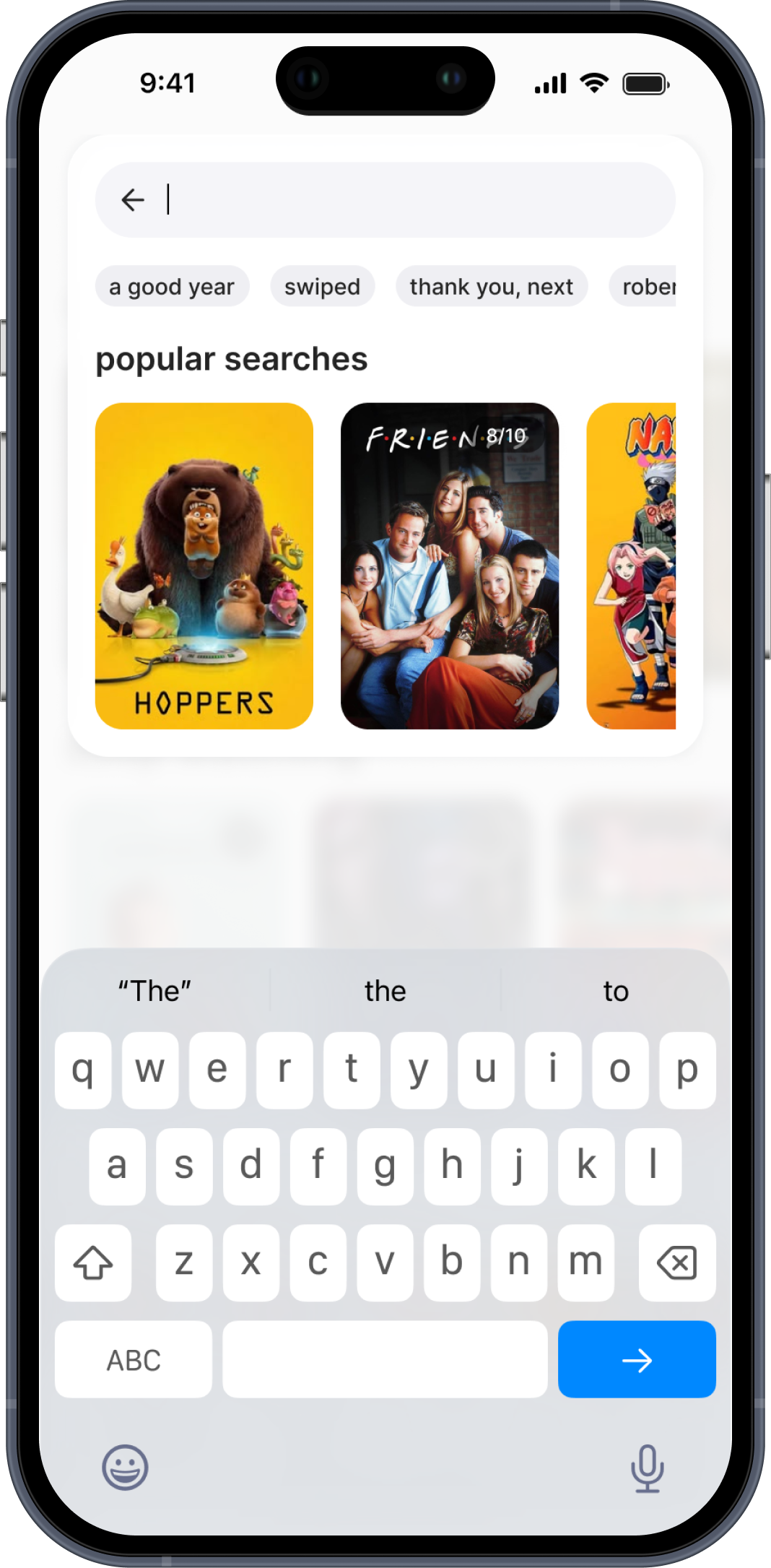
Flicko is a social platform for people who love movies and series. it's a space where you understand your own taste, find what to watch next, and share that with others.
I co-founded Flicko and designed the entire product from scratch: information architecture, all user flows, design system, UI across web and mobile.
the problem
Existing platforms like Letterboxd do the logging part well. But they don't really answer the question people ask every evening: what should I watch tonight?
The discovery layer is weak. The social layer is passive — you see what others watched, but it doesn't help you decide anything. And when you're choosing with someone else, there's no tool for that at all.
We wanted to build something that makes discovery personal, fast, and social, without replacing what already works.
01. flickpick
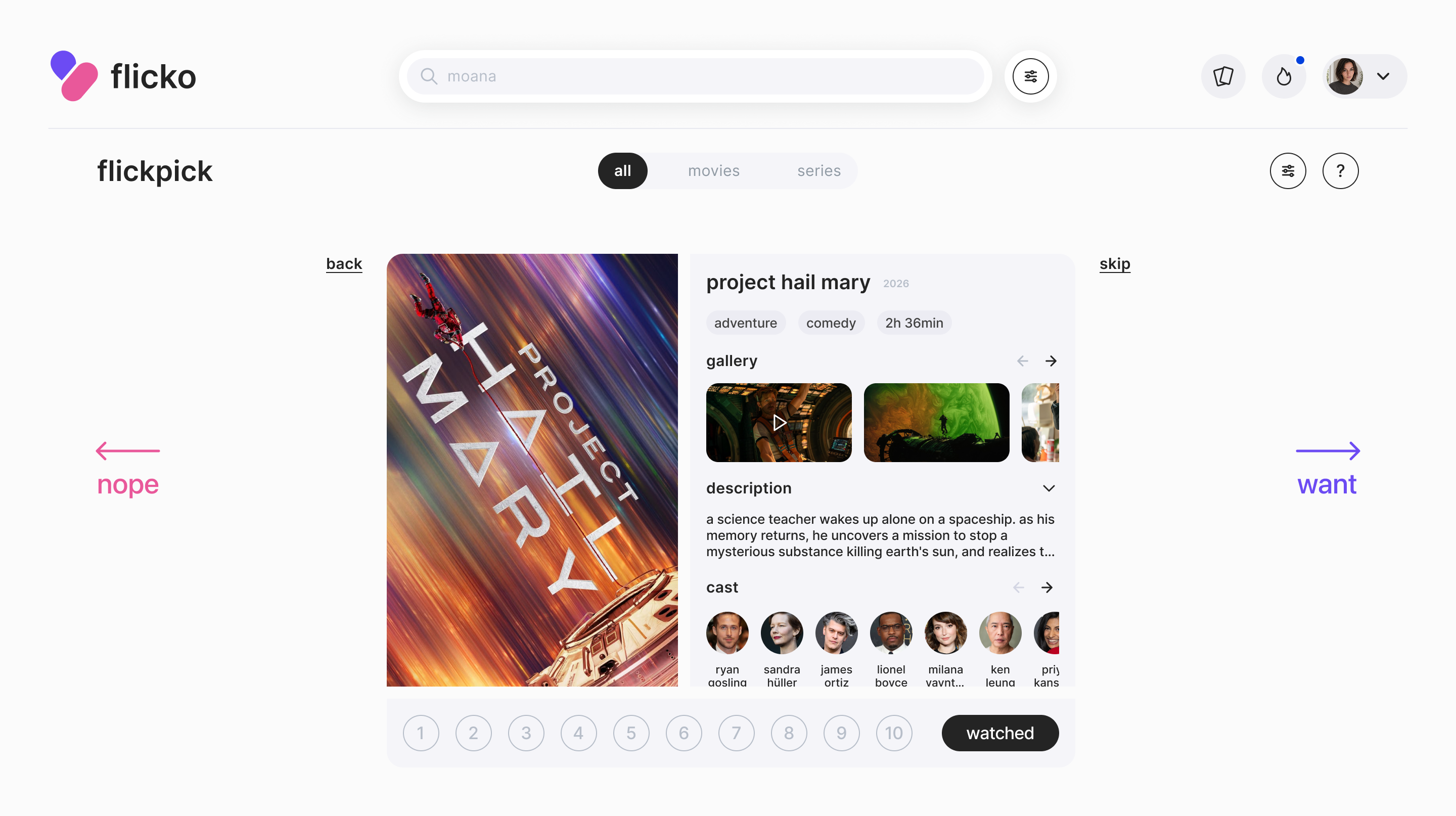
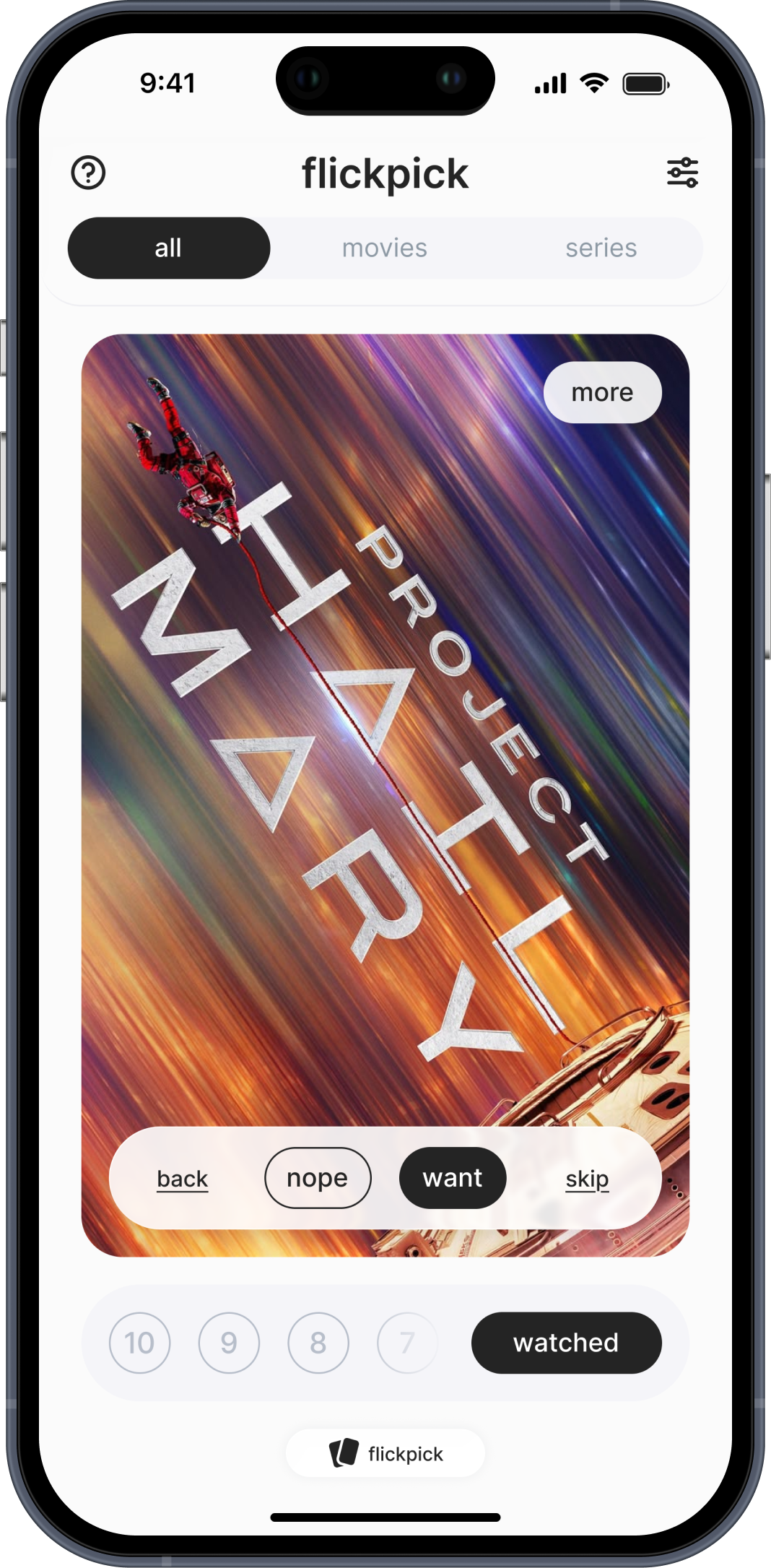
Most recommendation systems give you a list. You scroll, feel overwhelmed, close the app, and end up rewatching something familiar.
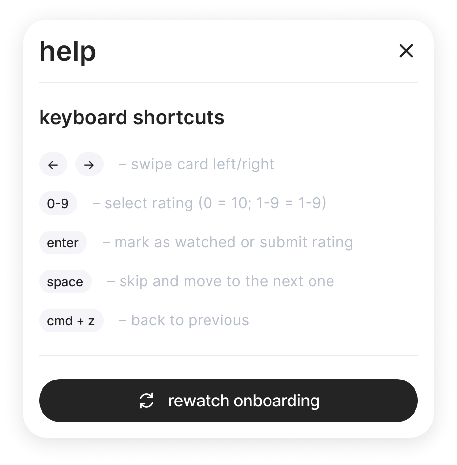
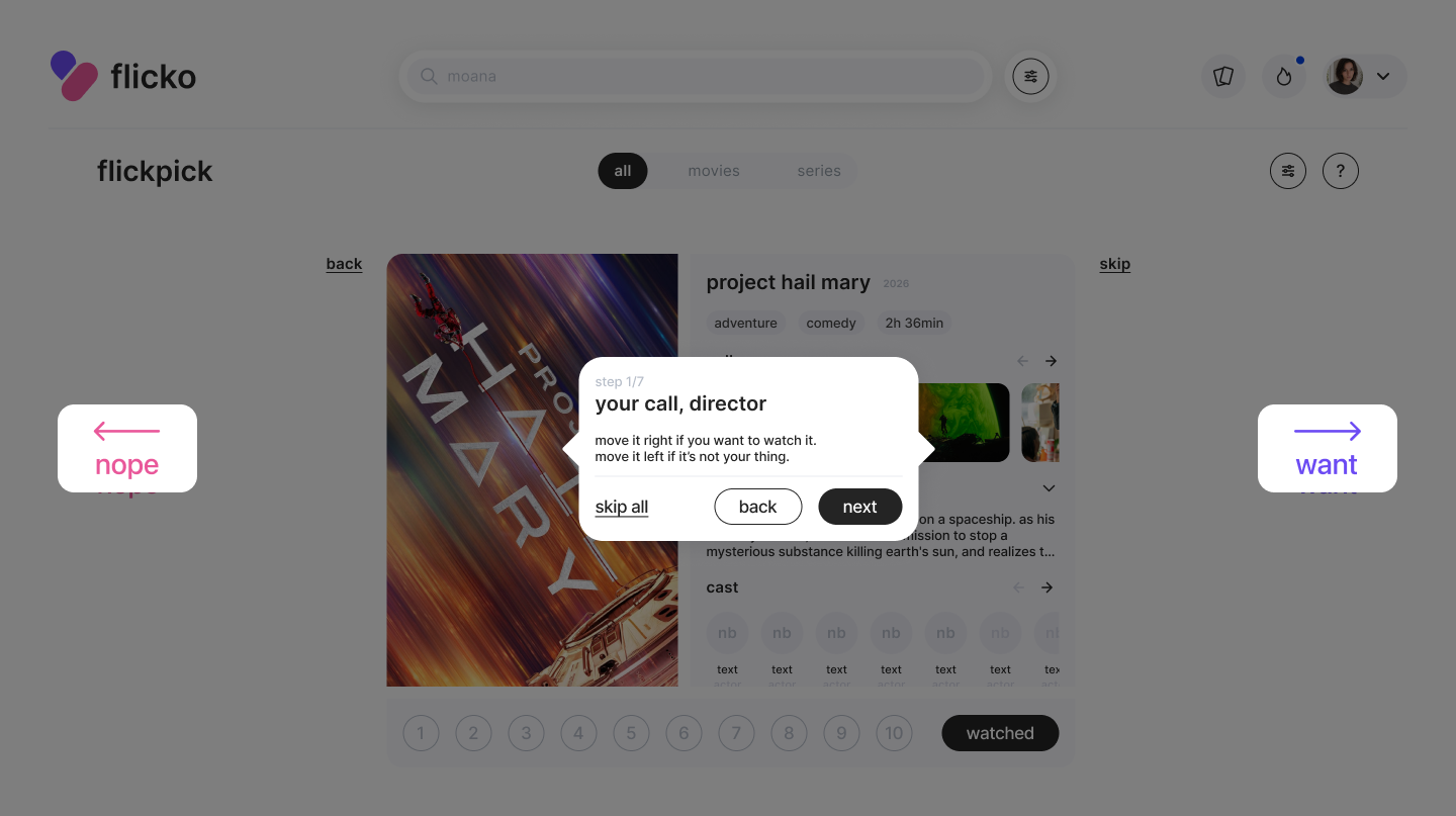
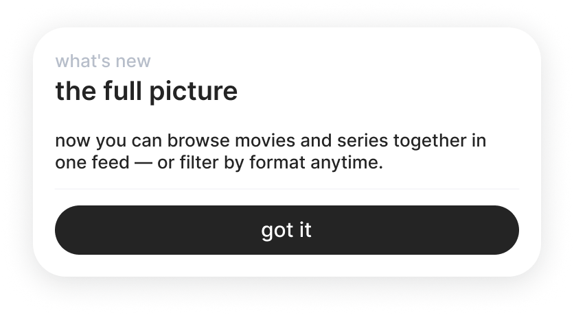
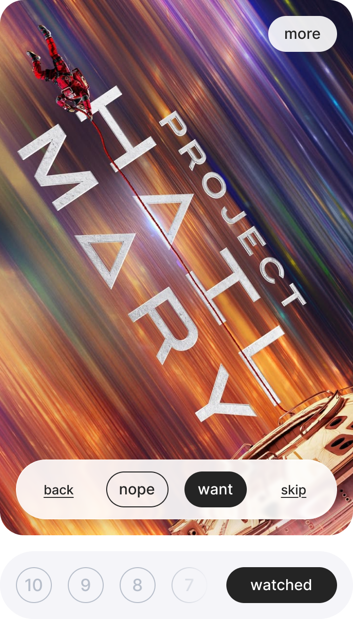
We wanted to remove the friction from the decision itself. Swipe mechanics are already wired into muscle memory — people make quick yes/no calls in dating apps without thinking. We borrowed that pattern and applied it to film discovery.
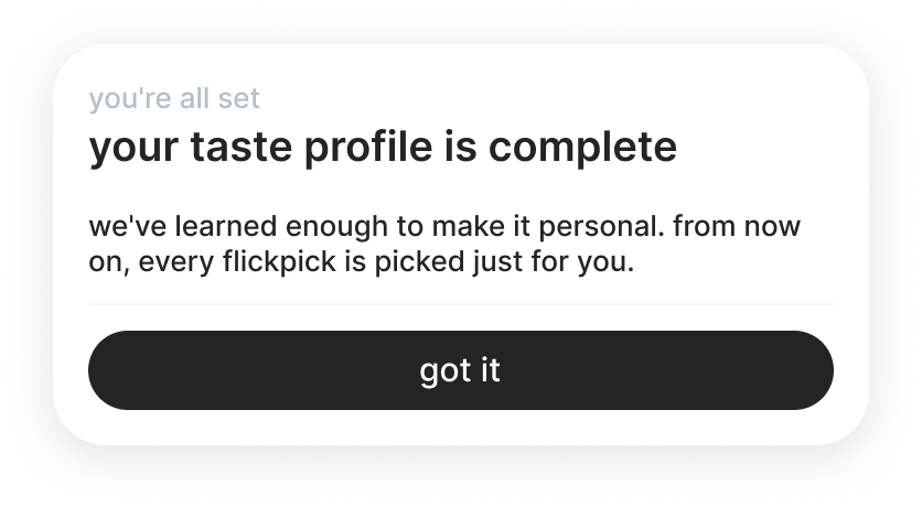
The algorithm doesn't start with your taste — it can't, it doesn't know you yet. So it begins with popular titles to collect signal, then gradually narrows toward what's actually relevant to you. The longer you use it, the more accurate it gets.
web vs mobile
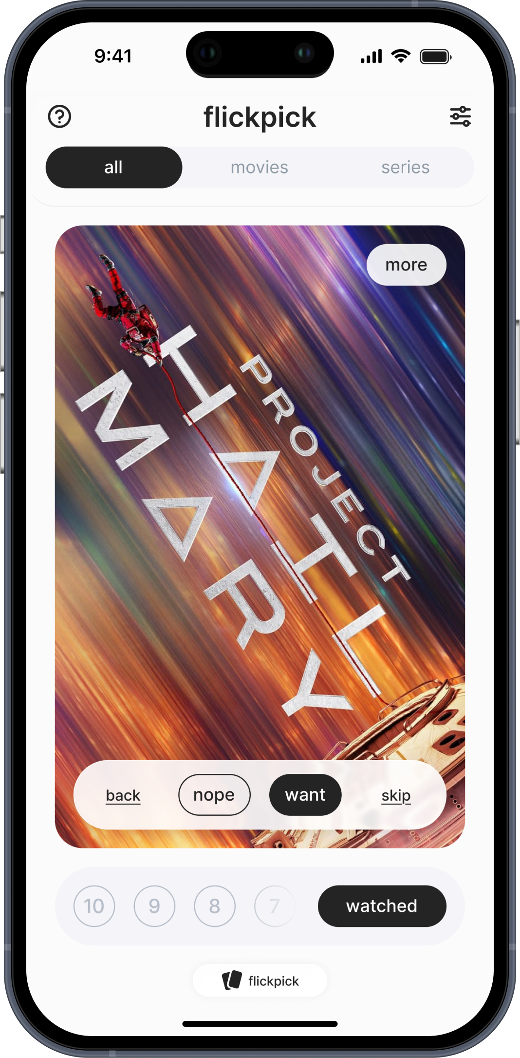
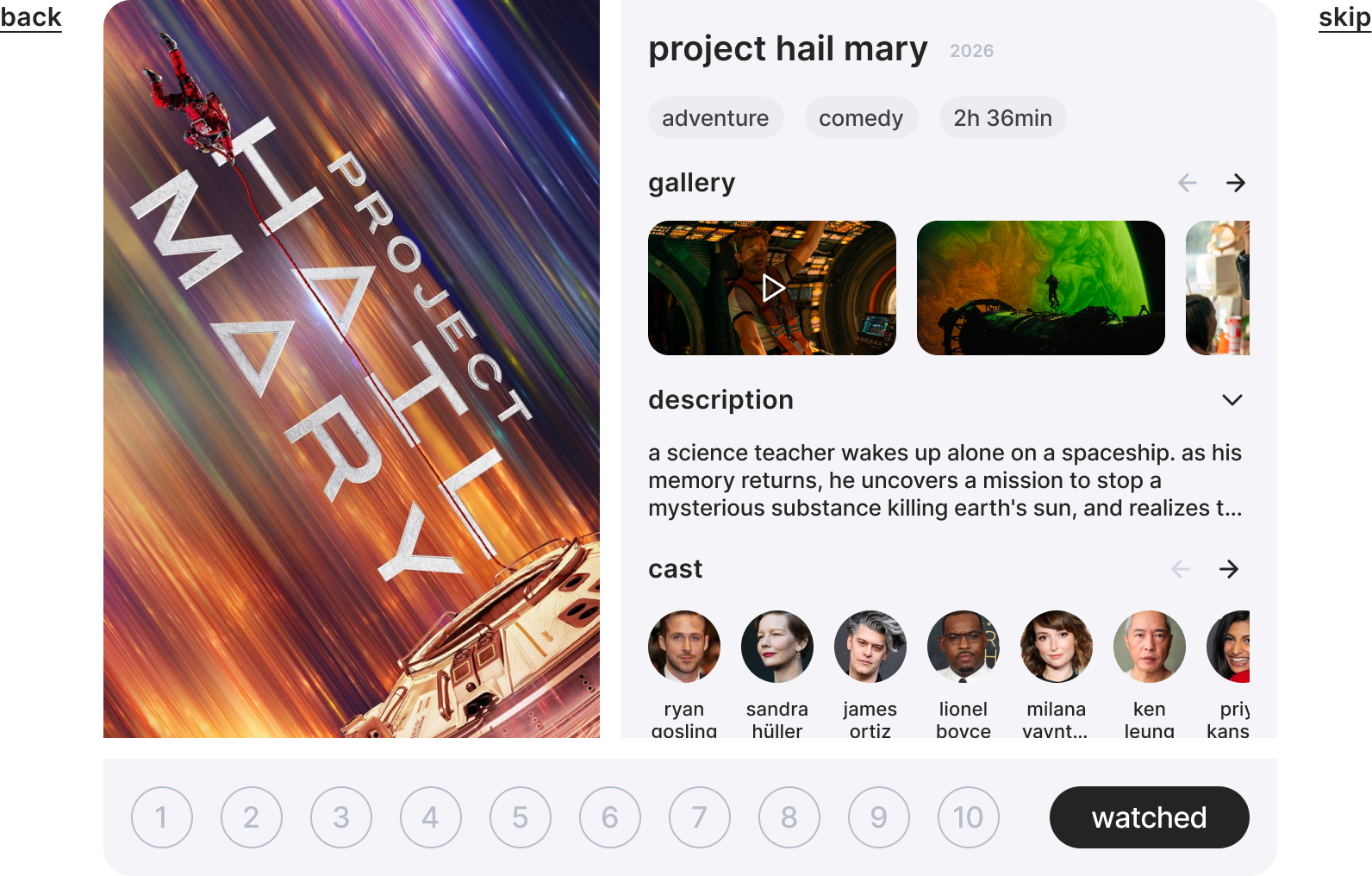
Same feature, two different contexts.
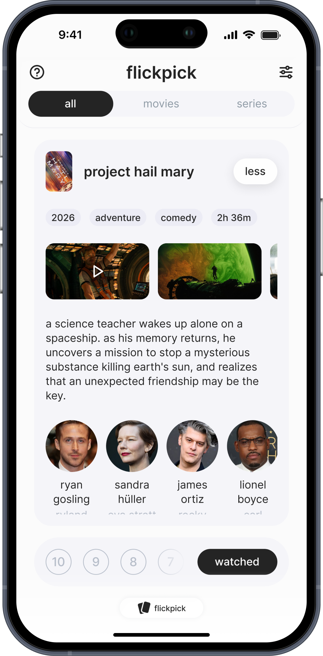
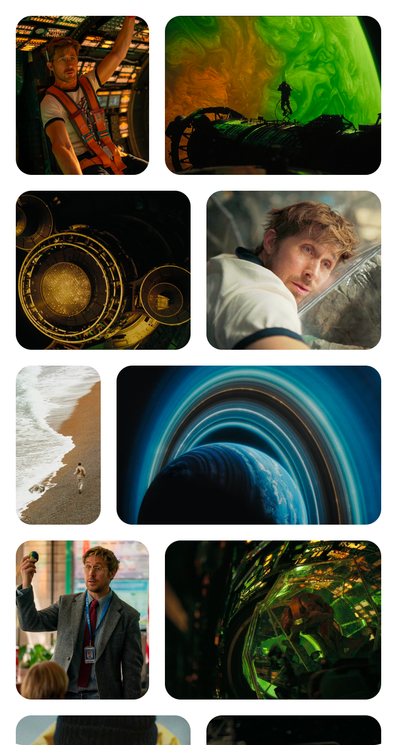
On web, the card is horizontal — poster on the left, all the details on the right: description, gallery, cast. Everything visible at once, no extra taps needed.
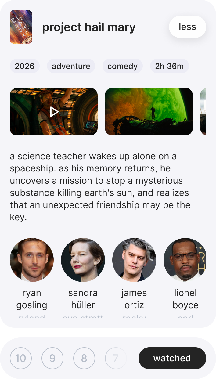
On mobile, a horizontal card simply doesn't fit. So the card shows the poster first. Tap "more" and it flips — description, gallery, details appear. Same information, different form factor.
02. match
"What do you want to watch?" is a question that somehow takes 40 minutes to answer.
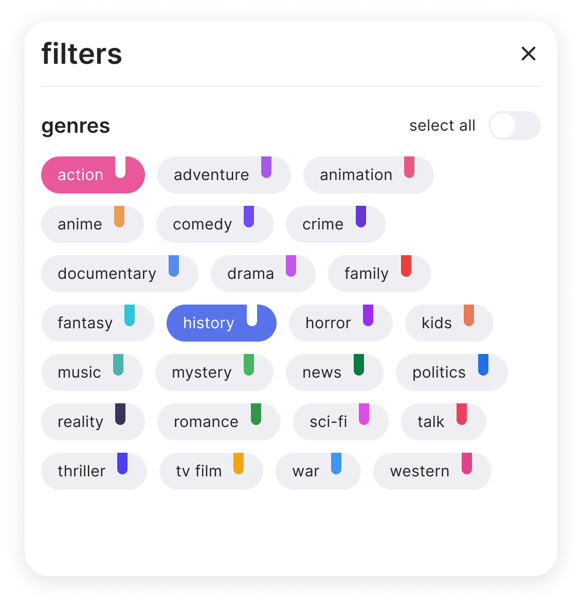
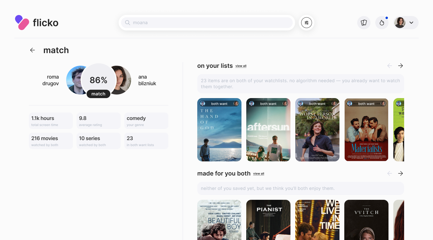
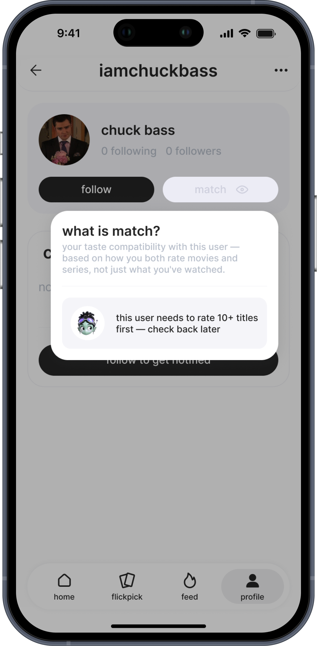
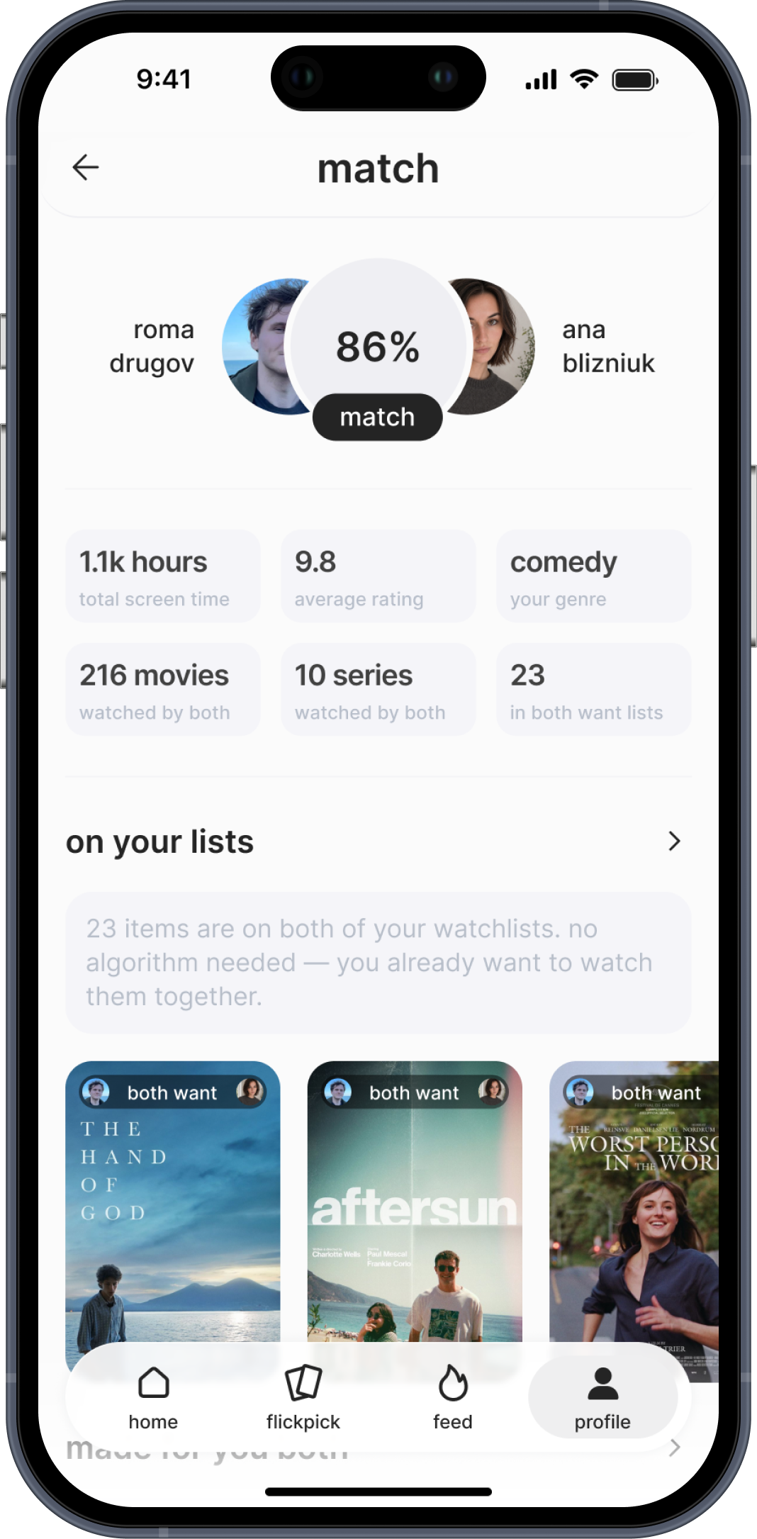
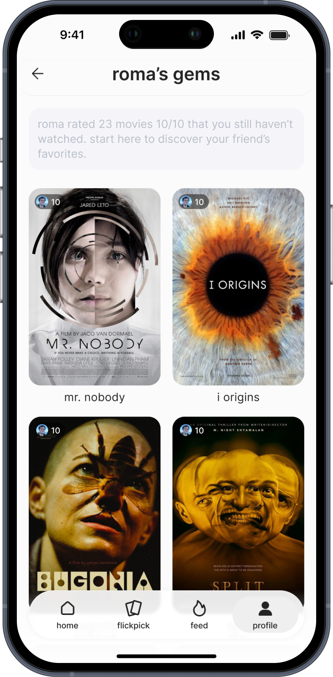
Match is our solution. Connect with a friend and see: what you both added to your watchlists, series you both started but never finished, films they rated 10/10 that you haven't seen, your strongest shared genres.
The goal is to shrink that 40 minutes to one scroll — and give you a real reason to open the app together, not just alone.
03. profile
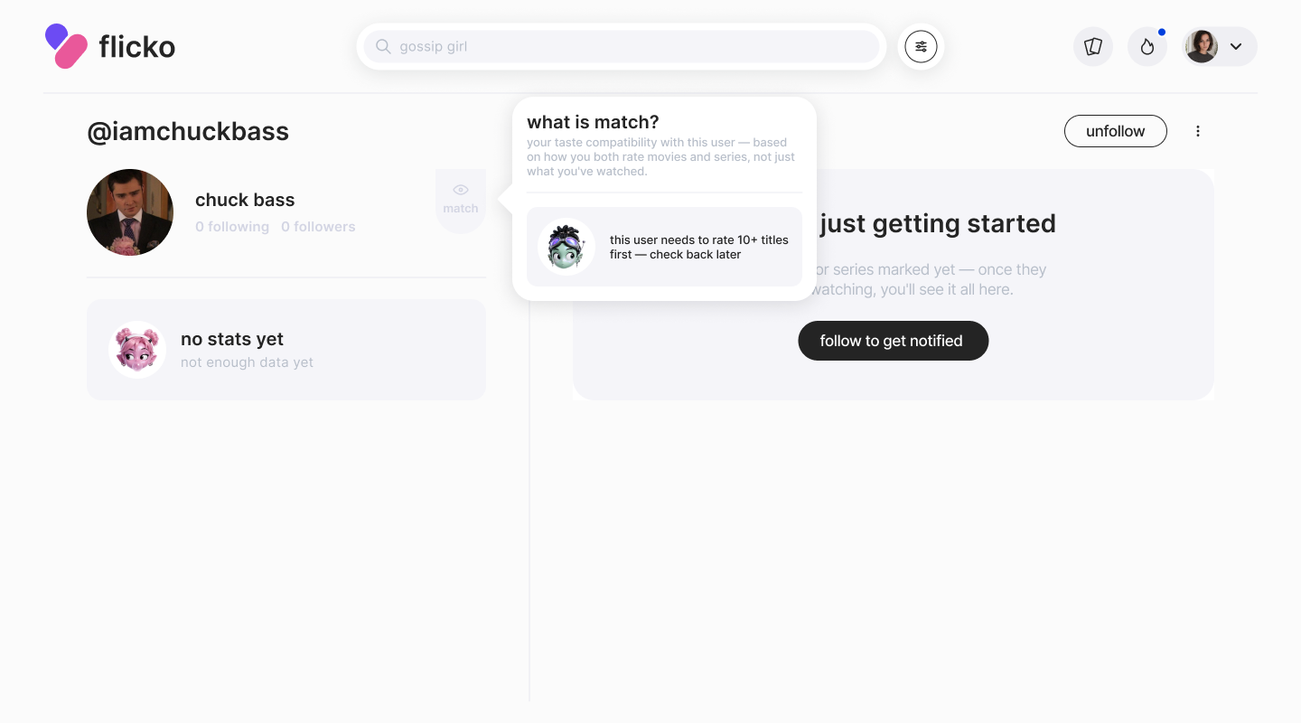
Your profile is where everything about your taste lives: what you've watched and want to watch, your reviews, favorite actors and directors — both for you and for anyone checking out your profile.
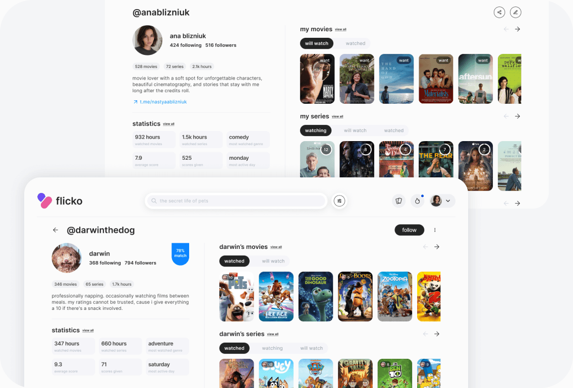
The tabs adapt depending on whose profile you're looking at. On your own: will watch / watched for movies, watching / will watch / watched for series — built around what you're actively managing. On someone else's, the order shifts to lead with what they've already seen, since that's what you came to check.
New users get a short onboarding that walks through the profile — so nothing feels hidden on day one.
statistics
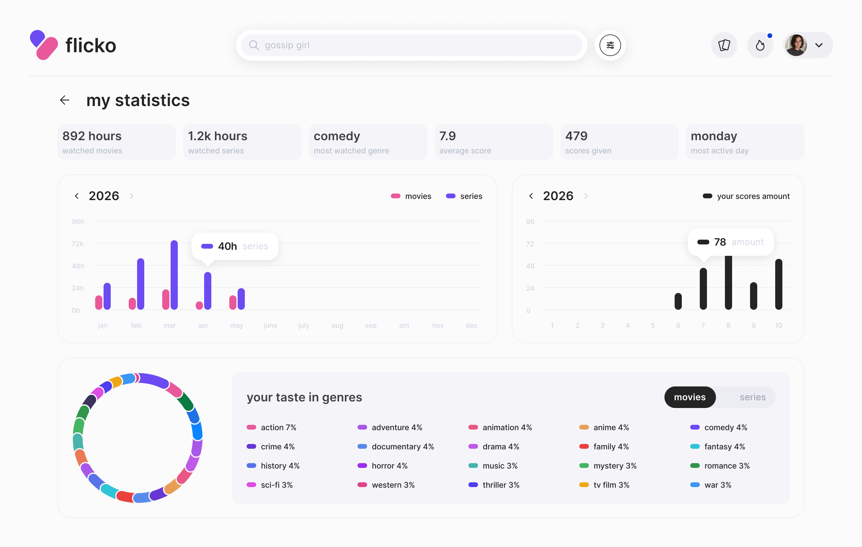
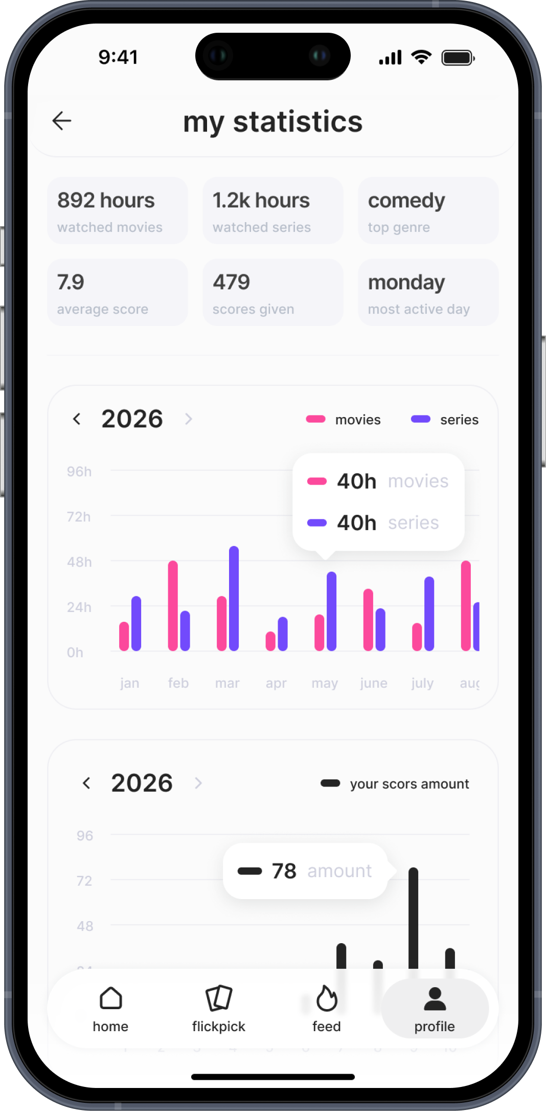
Most people don't know what they actually watch. They think they love thrillers, but really it's drama. They think they watch a lot, but can't remember what.
Statistics shows you: total hours watched, average rating, most active day, genre breakdown by year. Not as a gimmick — as a mirror. When you understand your taste, FlickPick gets more useful. When you share your stats, Match gets more meaningful.
04. ratings
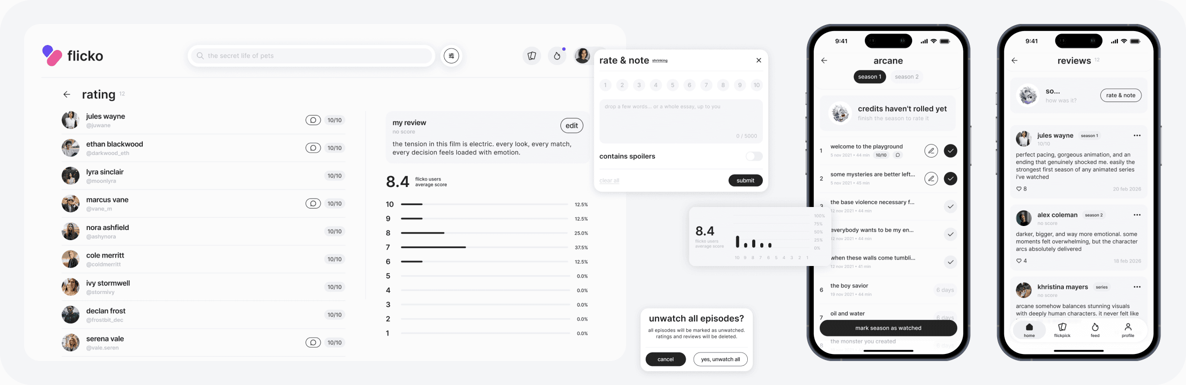
Rating a full series as one thing is too blunt. Season 1 of a show can be a 9. Season 3 might be a 5. Collapsing that into one score loses information — both for the user and for the algorithm.
So we let people rate and review at every level: full series, individual seasons, individual episodes. It sounds like a small decision. But it changes how much people engage, and how much signal the system collects.
05. feed
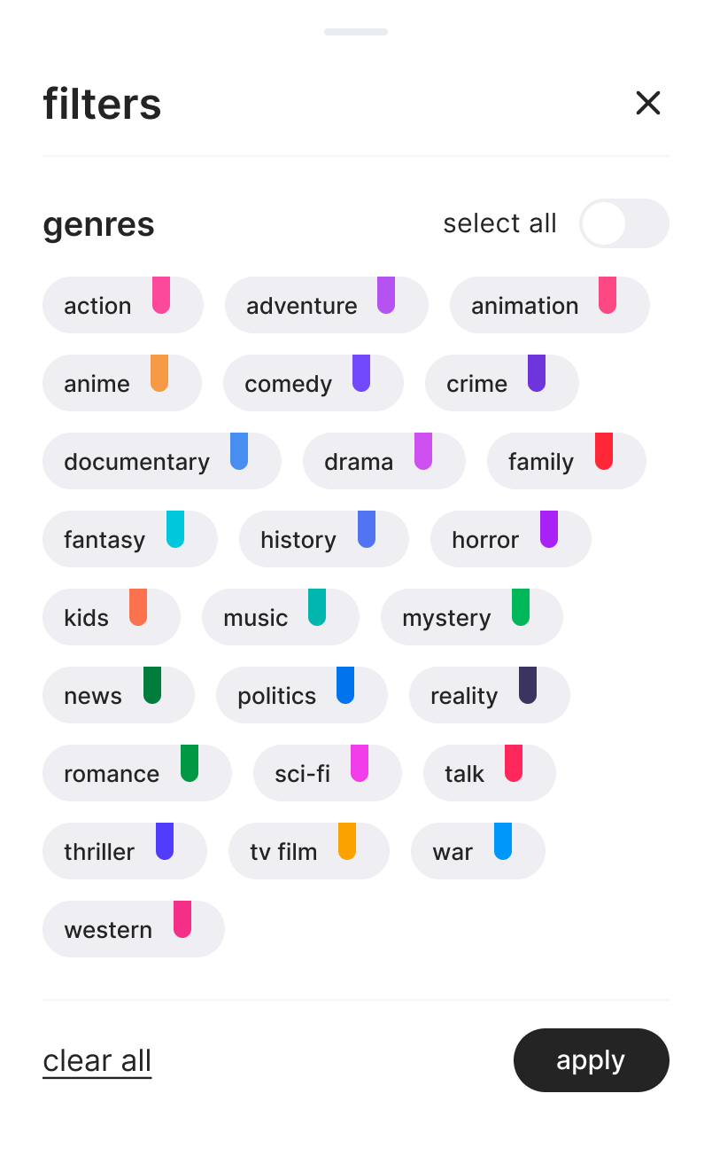
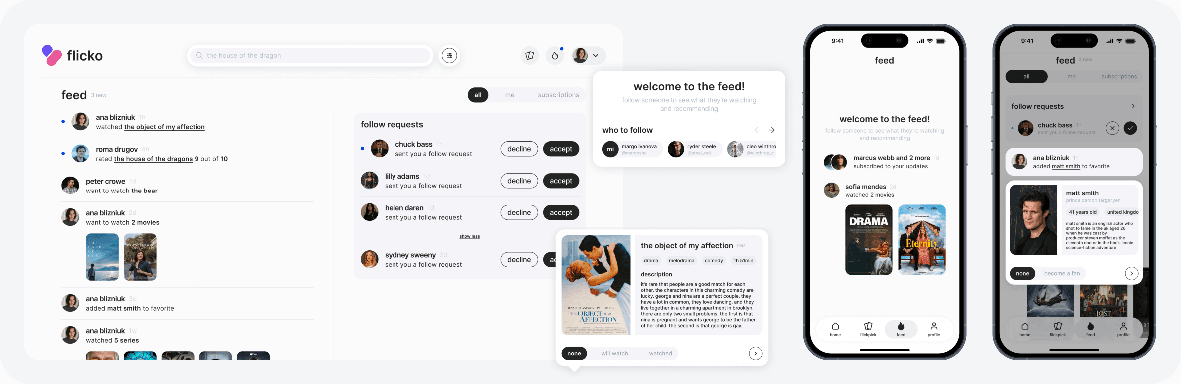
A quiet layer of social proof. See what friends are watching, rating, and adding to their lists in real time — hover over any title to preview it without leaving the feed.
It's not the core loop, but it's what makes Flicko feel alive when you open it.
06. design system
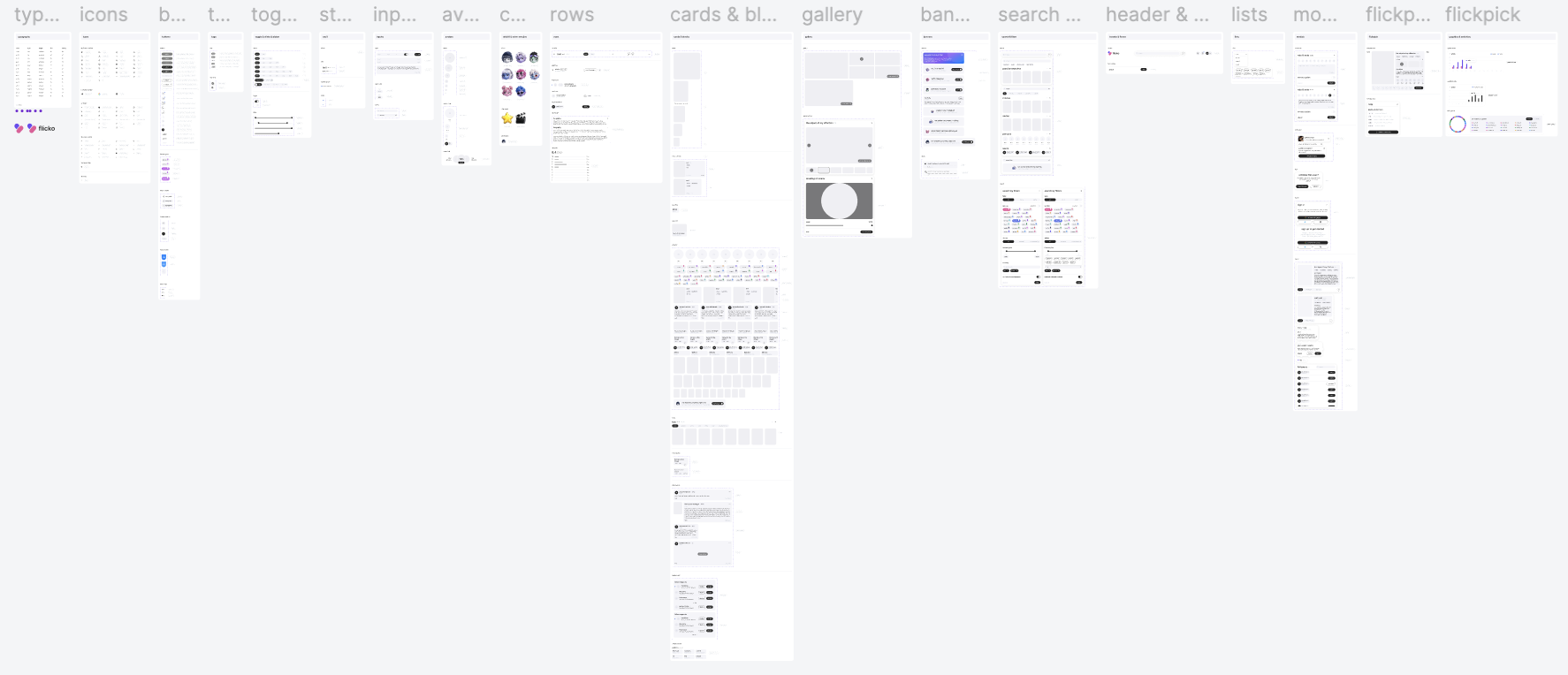
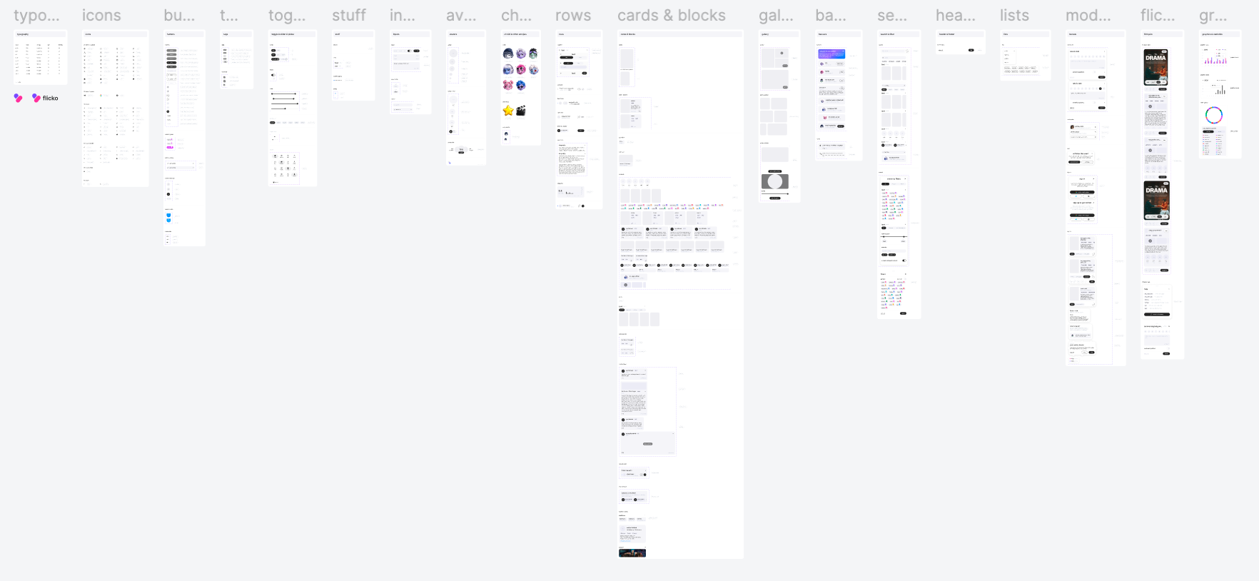
Built two separate design systems — one for web, one for mobile. Typography, icons, components, states, tokens.
where flicko stands
The product is approaching its full release — development is in the final stage. On dev, we're running UX tests and collecting bug reports from a target user group.
The first, simplest version of Flicko brought in 3,000+ organic users — no ads, no paid acquisition. Those users have left 5,500+ ratings, which tells us people aren't just signing up — they're actually using it.
The responsive web version launches first — works across desktop and mobile. Native apps for App Store and Google Play follow.
more projects
6 months, 2025–2026
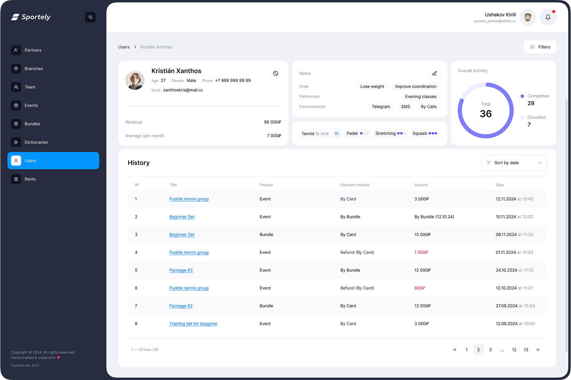
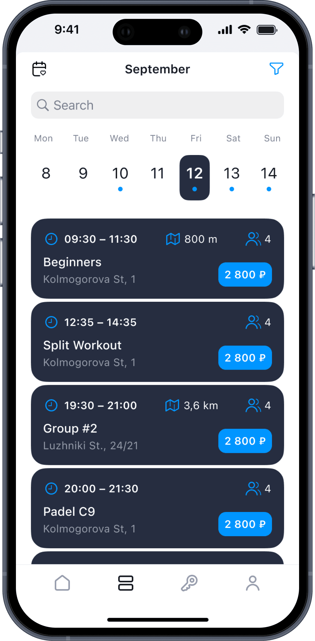
sportely
5 months, 2024–2025
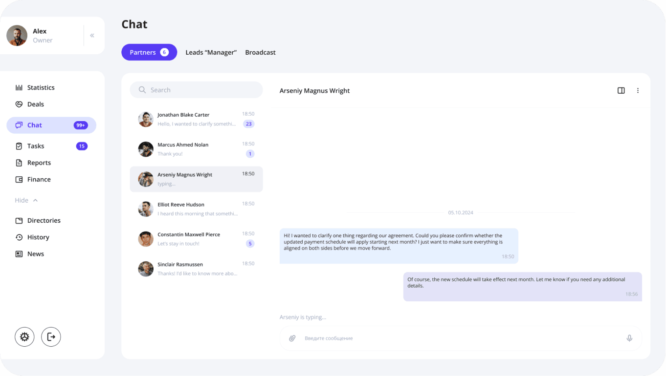
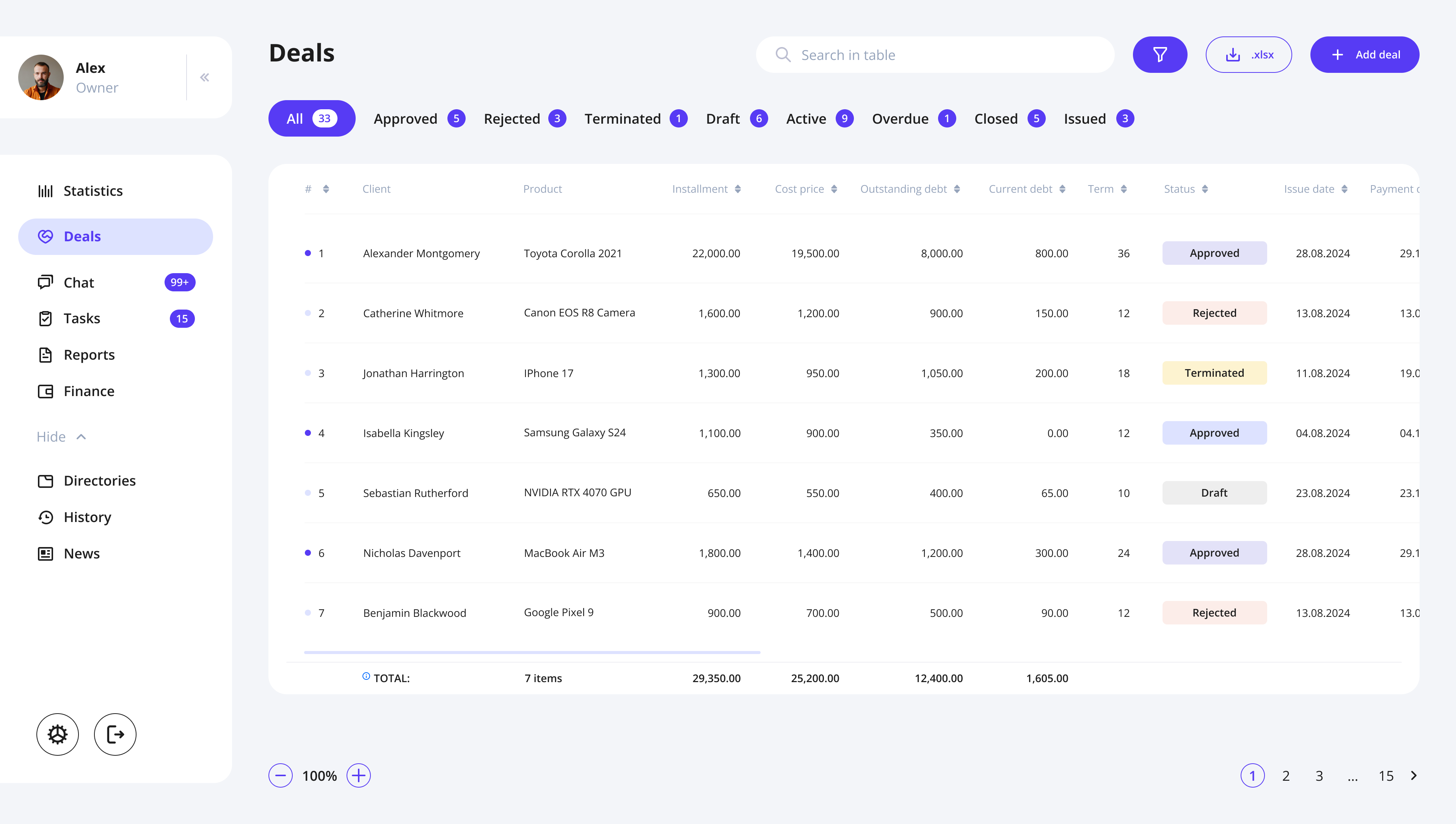
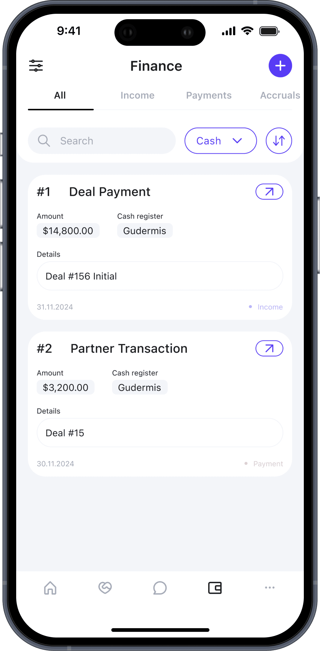
finance CRM
1 month, 2026
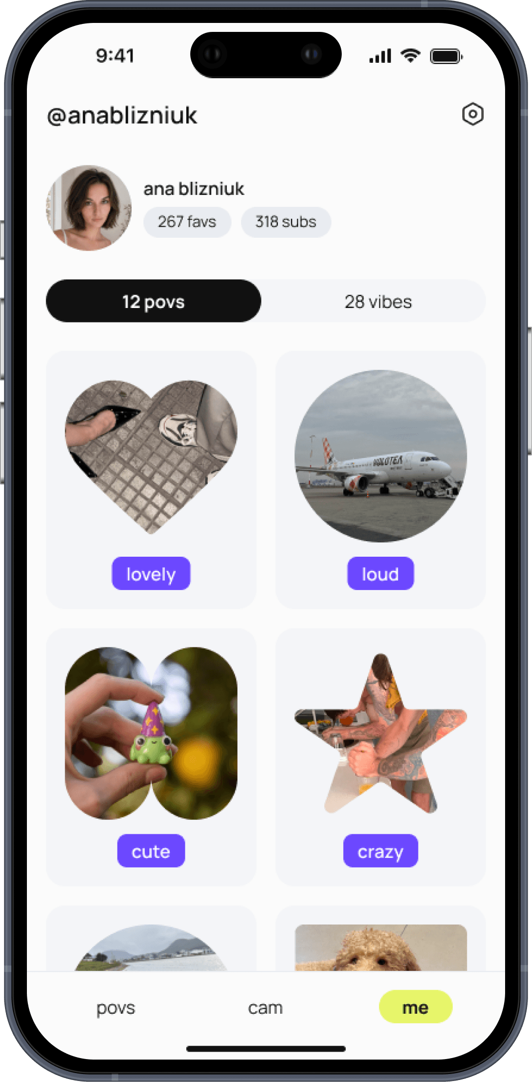
povee
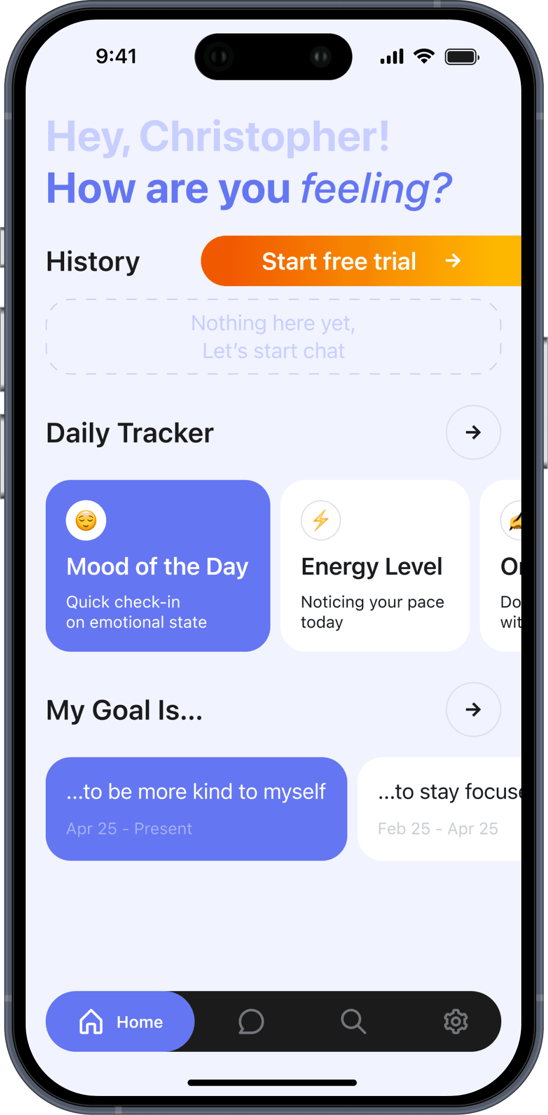
1 month, 2024
ai psychologist
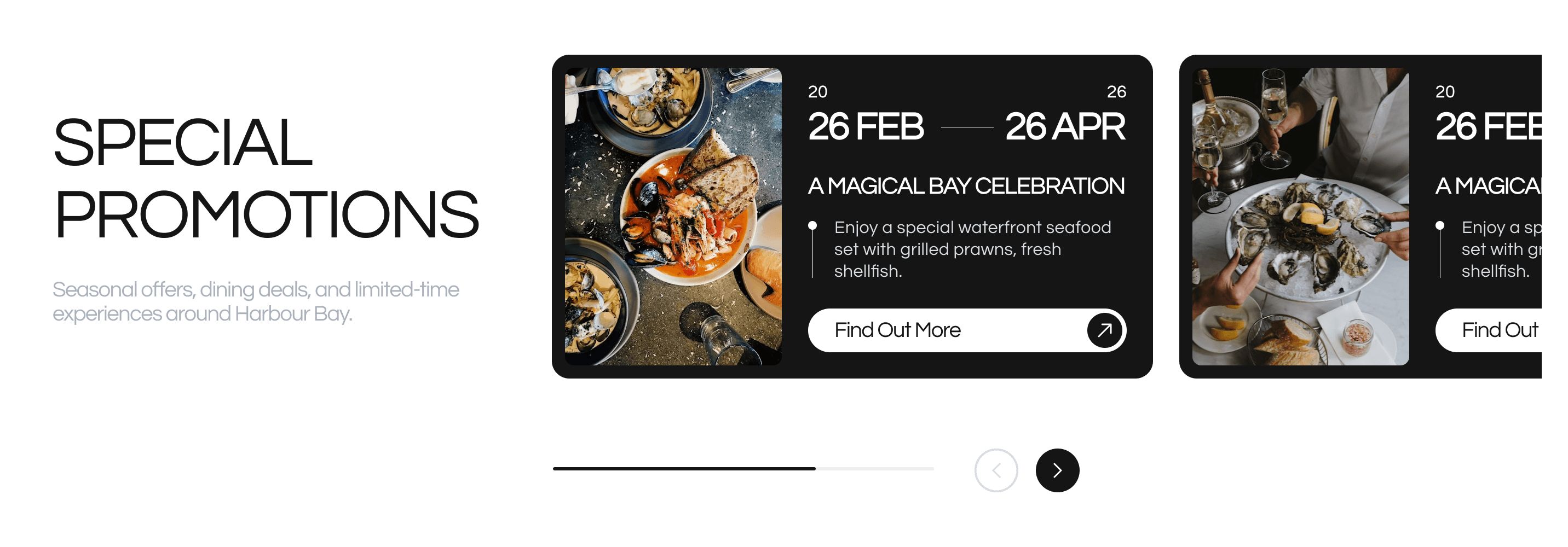
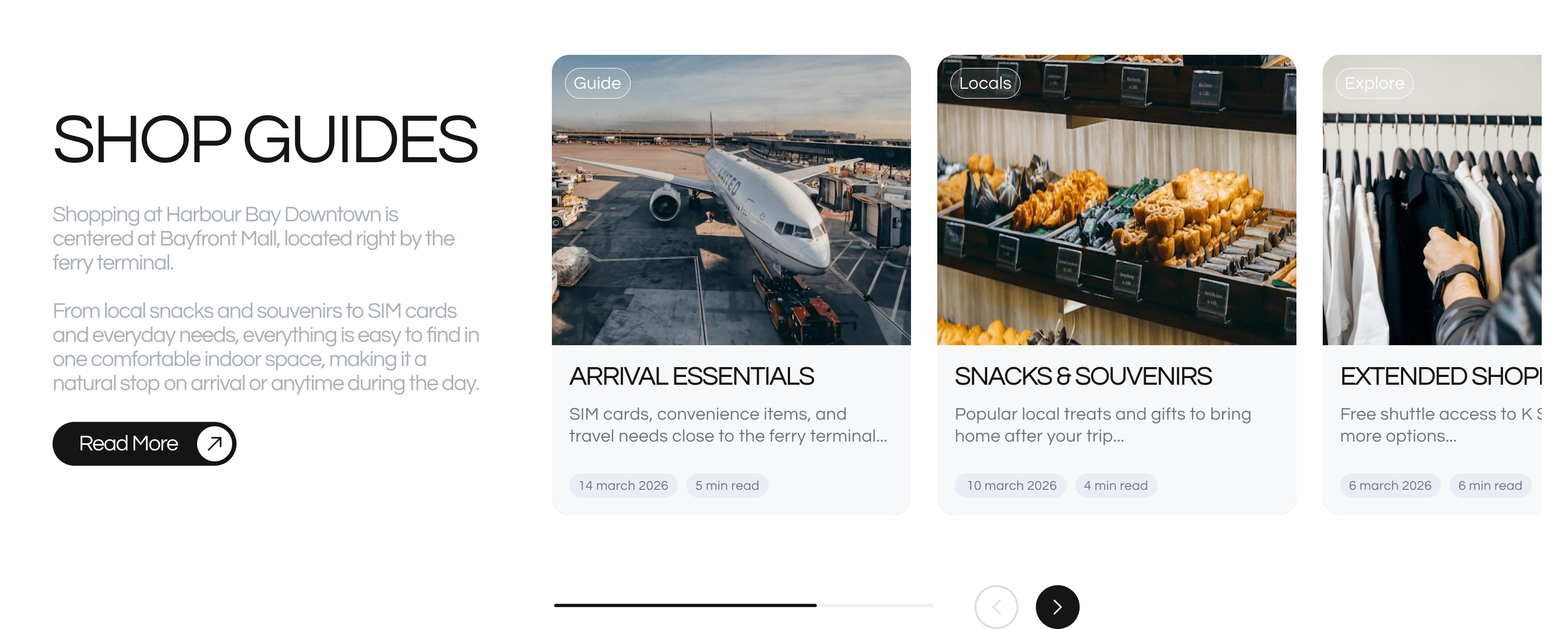
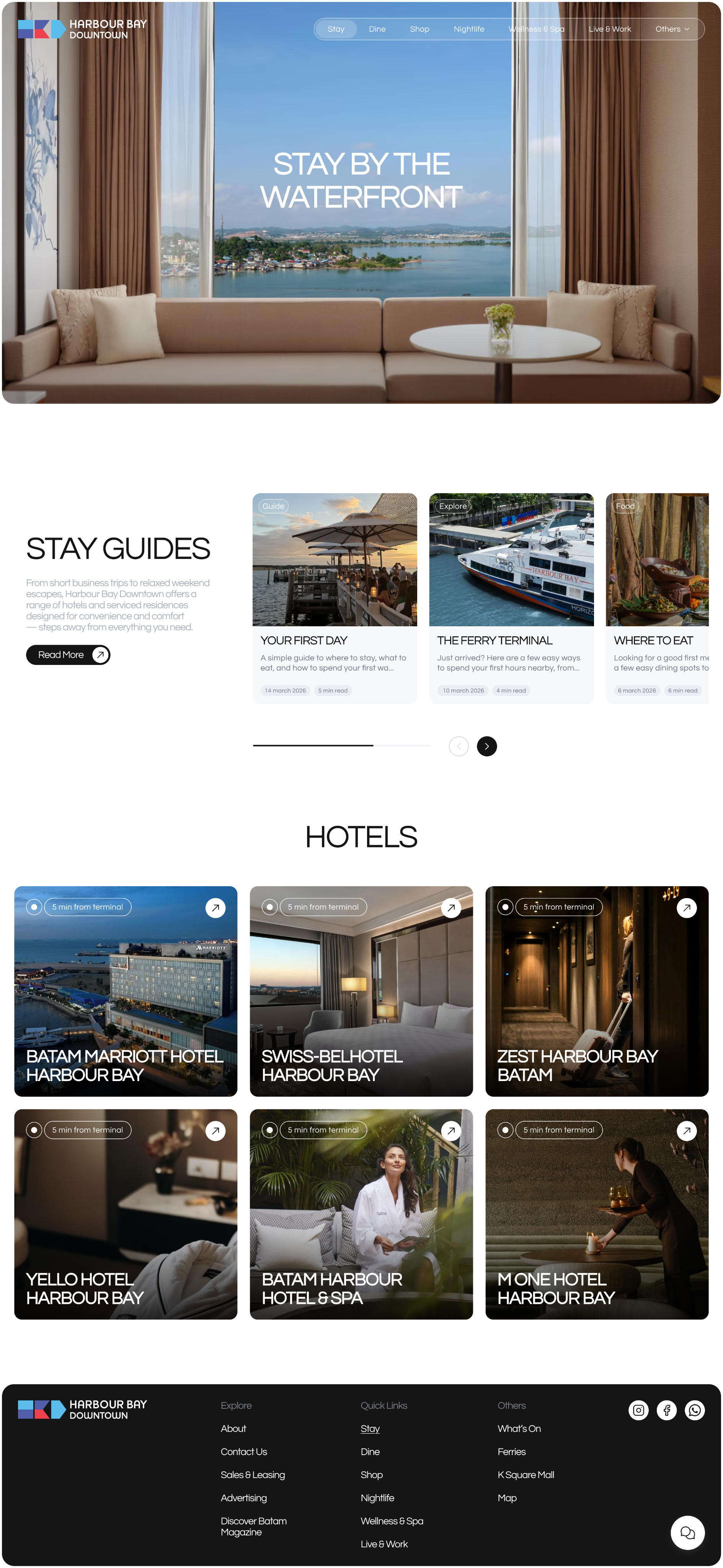
1 month, 2026
harbour bay

3 weeks, 2025
nirup island


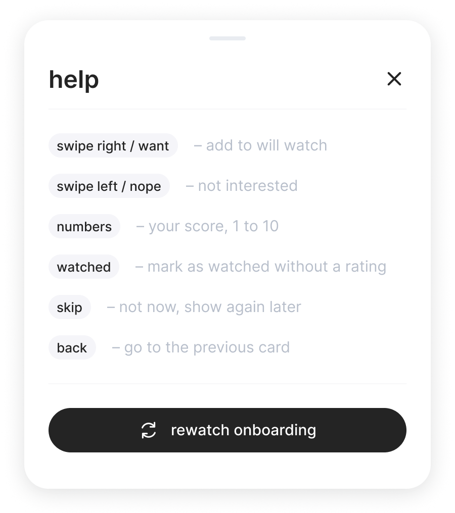
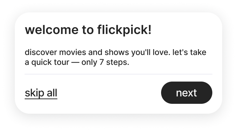
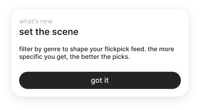
there's also a built-in onboarding that explains how flickpick works — and you can revisit it anytime. new users don't get thrown into a cold start.