my role
sole product designer CRM redesign + mobile adaptation
collaborated with
client · product manager · development team · internal users (interviews)
the context
This was a private enterprise CRM used by a financial company to manage lending operations: deals, client records, payment schedules, installment plans, and internal reporting.
My work had two phases. First, a full redesign of the web CRM. Then, translating that system into a mobile application for field employees and managers who work outside the office.
the problem
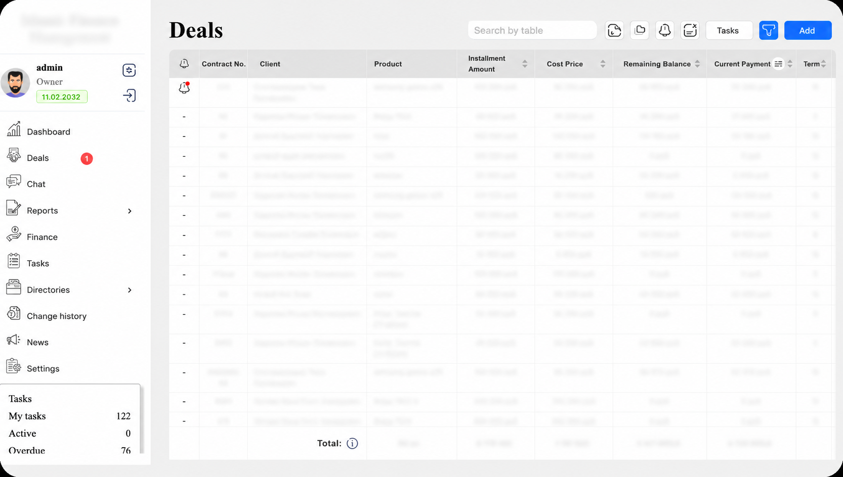
The original CRM was functional but painful to use. Dense tables, inconsistent layouts, no clear hierarchy across screens. People were working with financial data every day in an interface that made everything harder than it needed to be.
For a system where a misread number or a missed status can cause a real financial error, that's not just a UX problem, It's a risk.
hypotheses
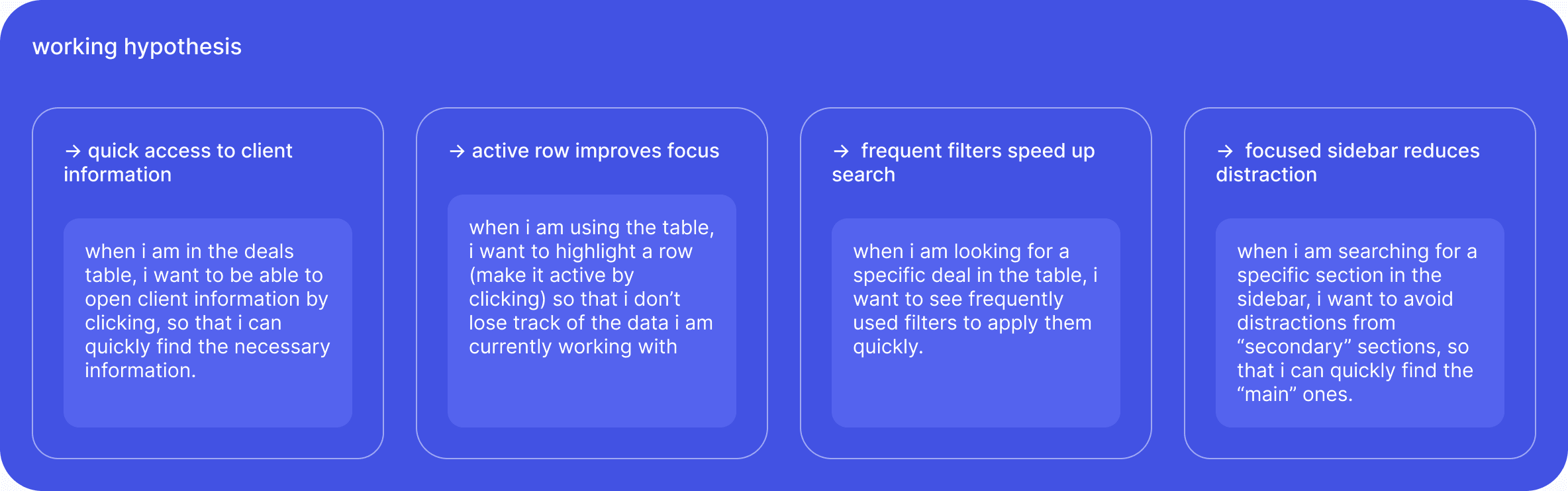
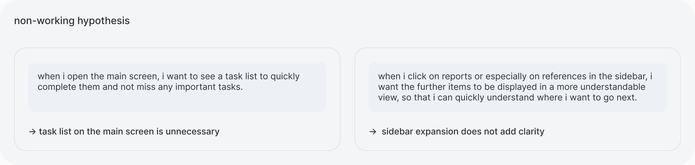
Before redesigning anything, I interviewed internal CRM users to understand where the real friction was. Not all hypotheses held up, and that shaped the direction.
01. CRM redesign
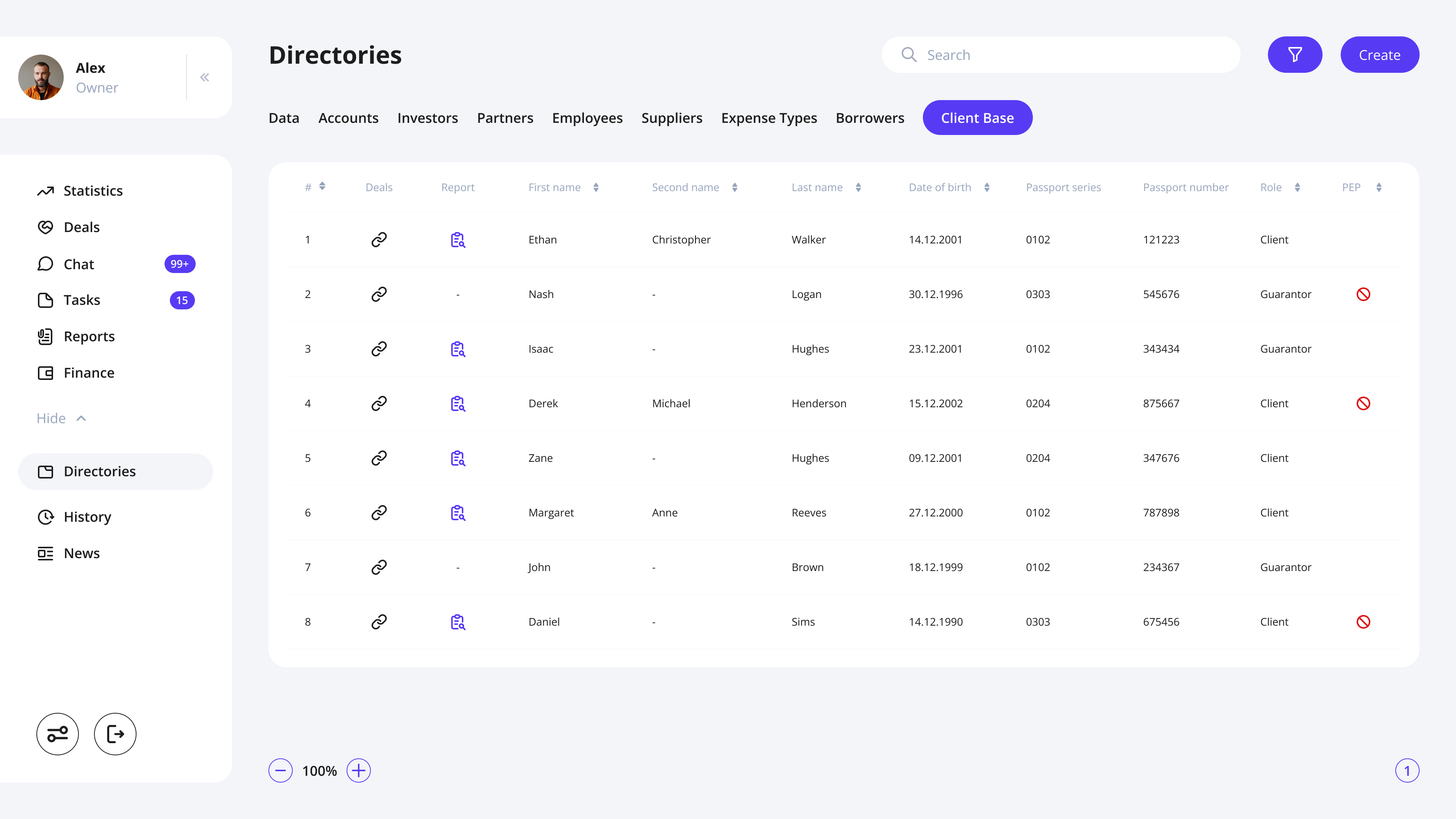
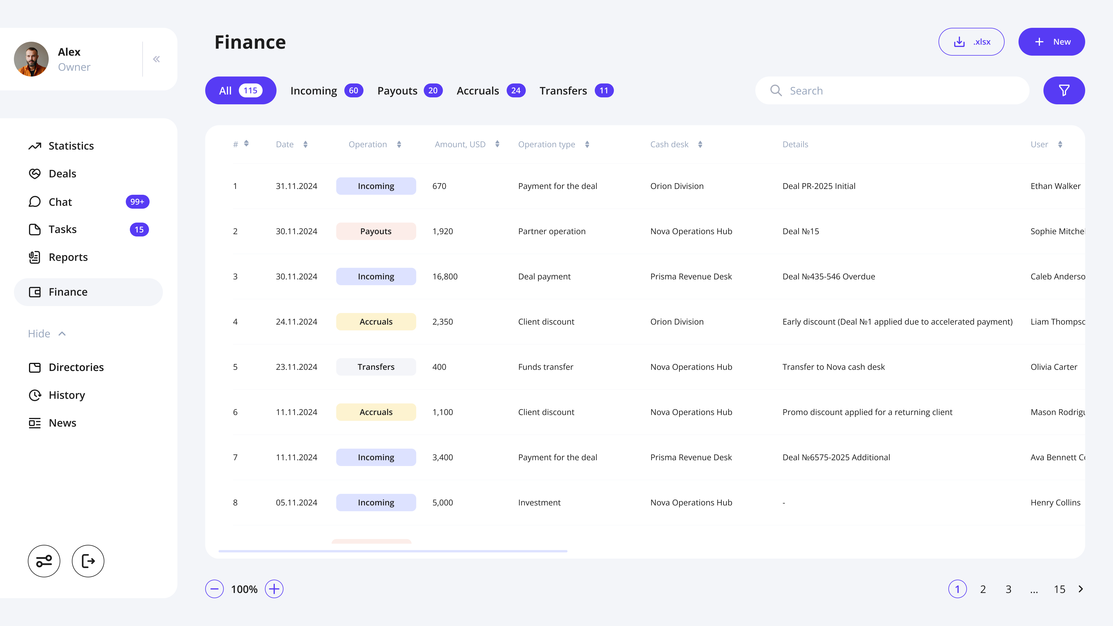
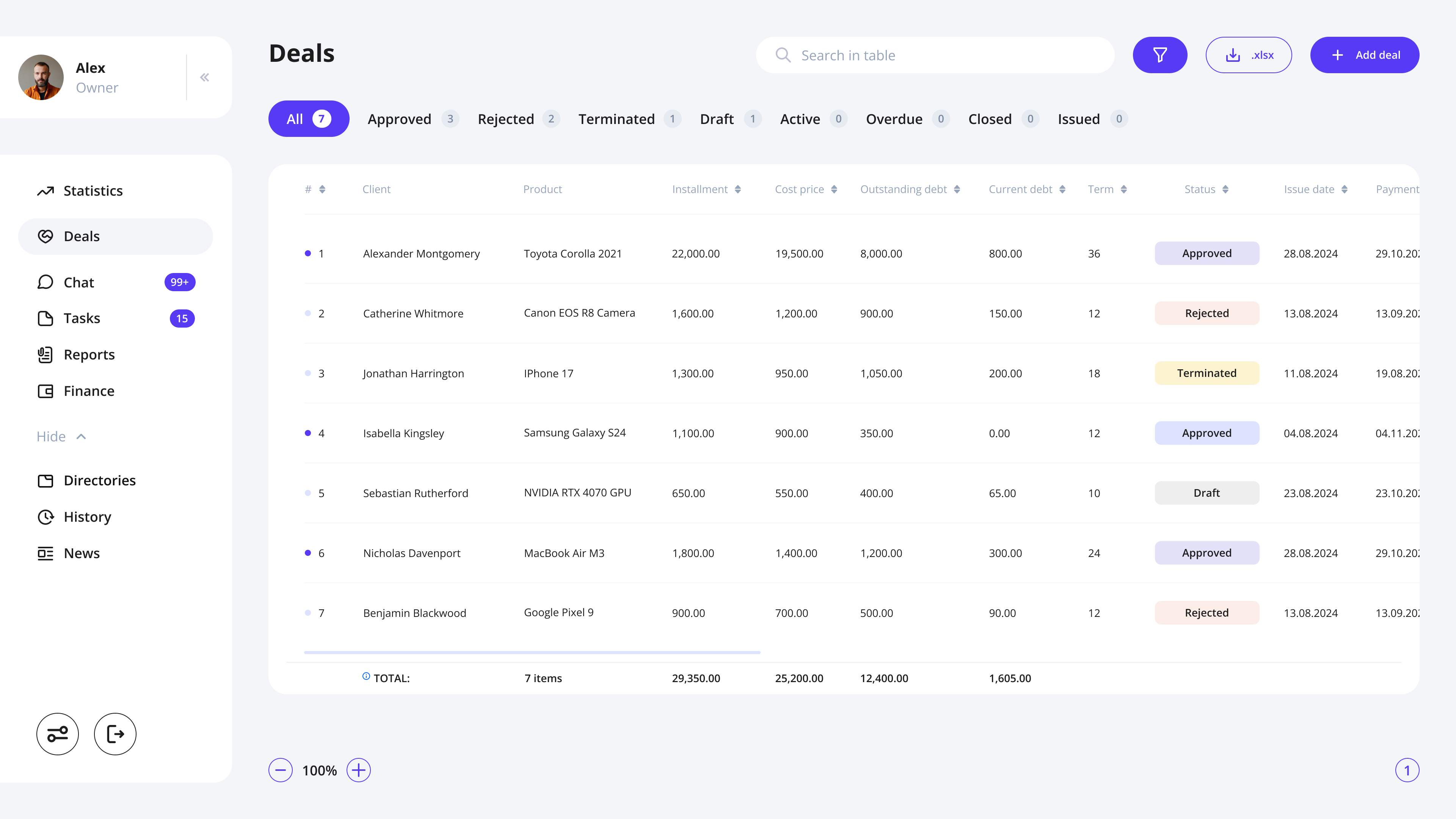
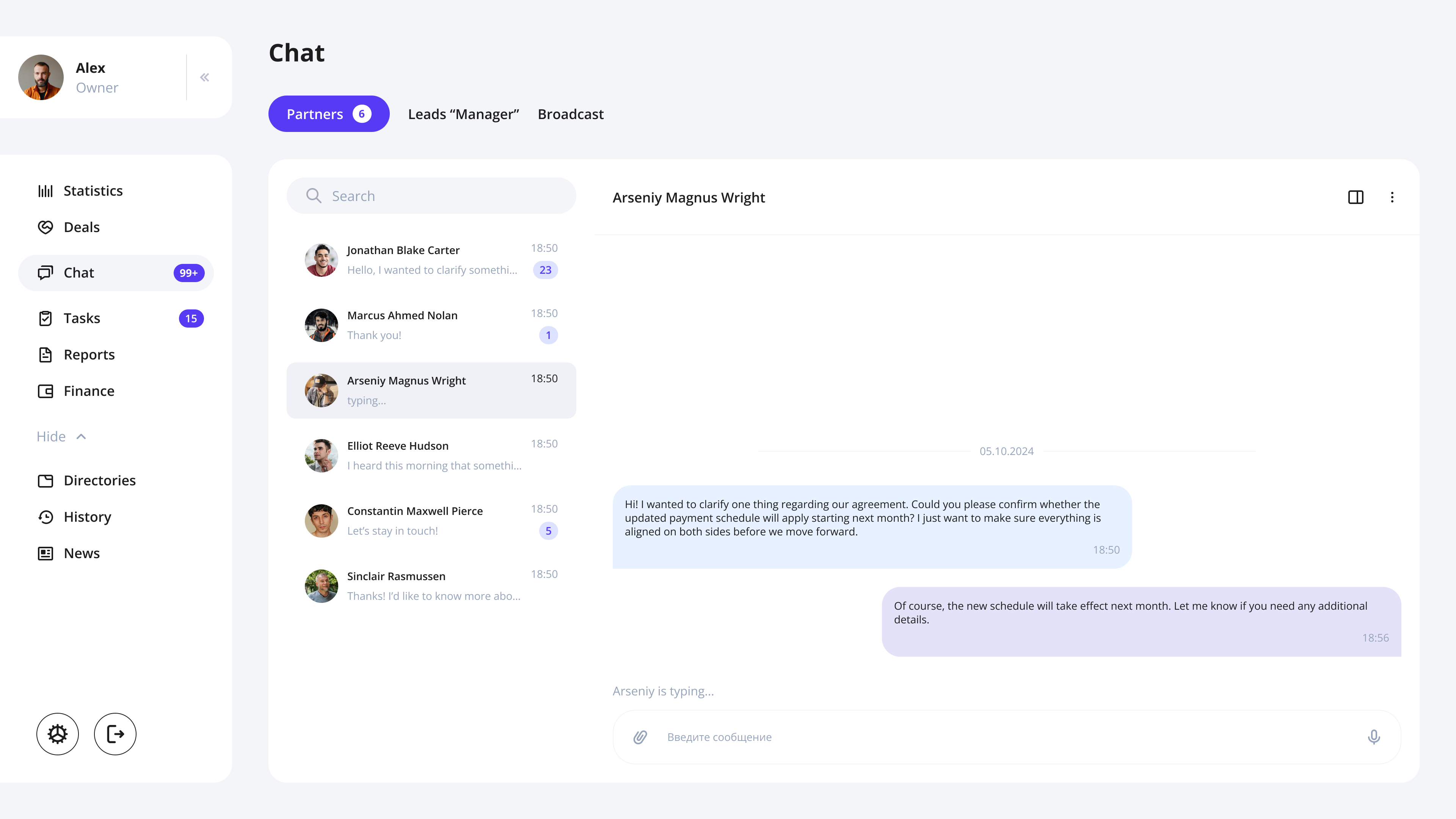
The redesign started with structure. Every screen needed a clear hierarchy so users could find what they were looking for without hunting. Financial data has to be readable at a glance, especially under time pressure.
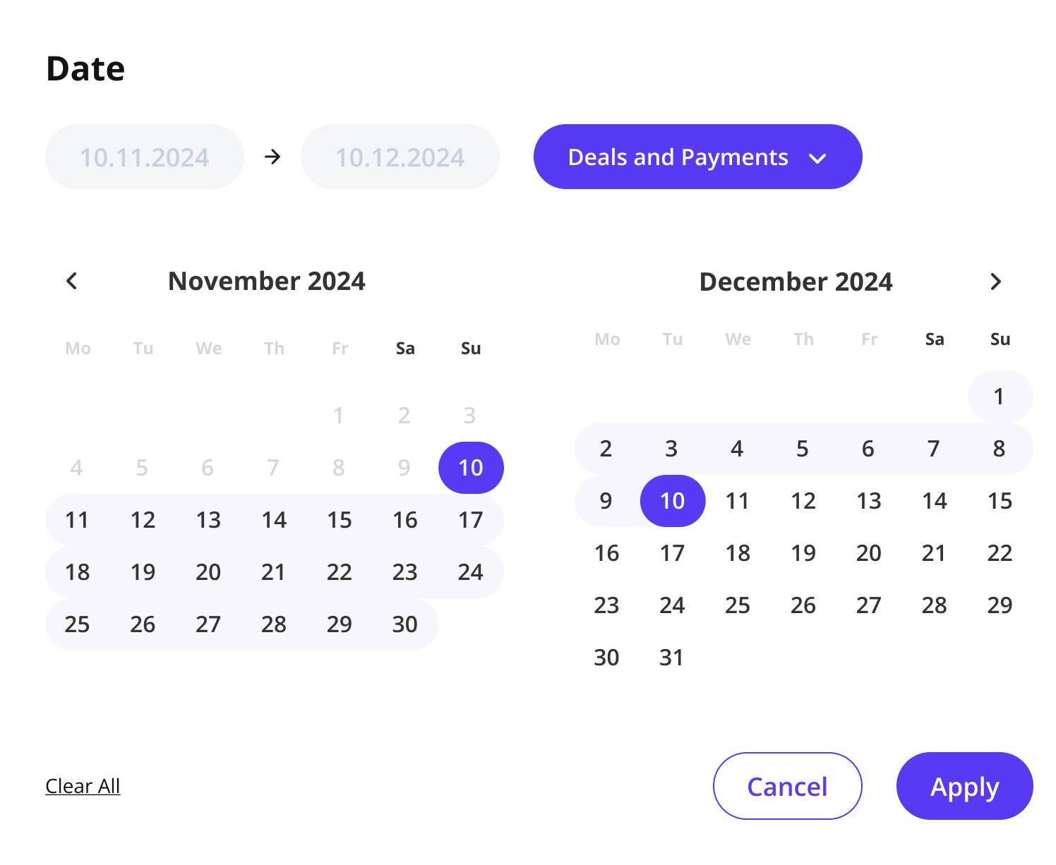
I updated the visual language across the entire system: consistent table layouts, clear status indicators, predictable navigation patterns, and streamlined flows for the most frequent tasks like creating deals, tracking payments, and managing client records.
The result was a system that felt like it was built for the work people were actually doing in it.
02. CRM to mobile
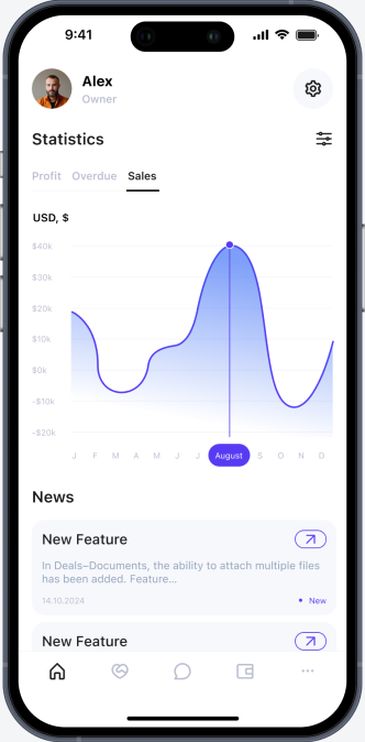
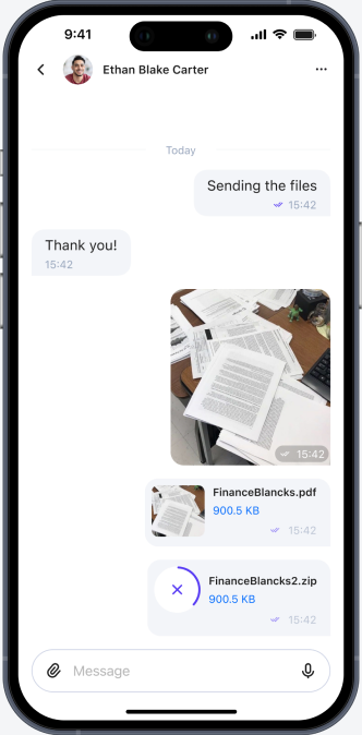
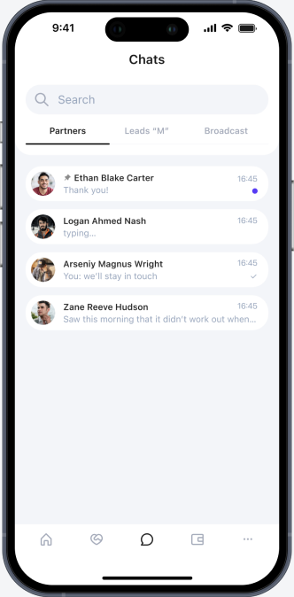
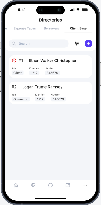
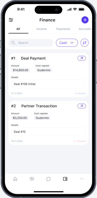
The mobile version couldn't just be a smaller version of the desktop CRM. Wide scrollable tables are already difficult on a large screen. On a phone they're unusable.
The core challenge was preserving full functionality while completely rethinking how data is presented. Every table row became a card with the most important information visible immediately. Navigation was rebuilt for one-handed use and quick access to key actions.
Field employees and managers now had a tool they could actually use on the go, not a desktop interface they had to fight with on a small screen.
what users said
"Before the redesign, managing financial records felt like a never-ending maze. Now I can locate specific transactions within seconds. It saves me nearly 30 minutes every day." — Finance Specialist
"The new dashboard consolidates key data points and presents them in a visually organized way, making it easier to monitor team performance and spot potential issues early." — Business Owner
outcome
The CRM became cleaner, faster, and more reliable for the people using it every day. Consistent structure and clearer hierarchy reduced the cognitive load of working with financial data and lowered the risk of errors. The mobile adaptation made the system genuinely usable outside the office, replacing heavy tables with a card-based layout built for quick decisions on the go.
more projects
12 months, 2025–now
flicko
6 months, 2025–2026
sportely
1 month, 2026
povee
1 month, 2024
ai psychologist

1 month, 2026
harbour bay


3 weeks, 2025
nirup island


here's a bit of the "before" design :)